Showing posts with label Barnett Newman. Show all posts

Friday, October 22, 2021

Some Sculpture Month Highlights

 Robert Boyd

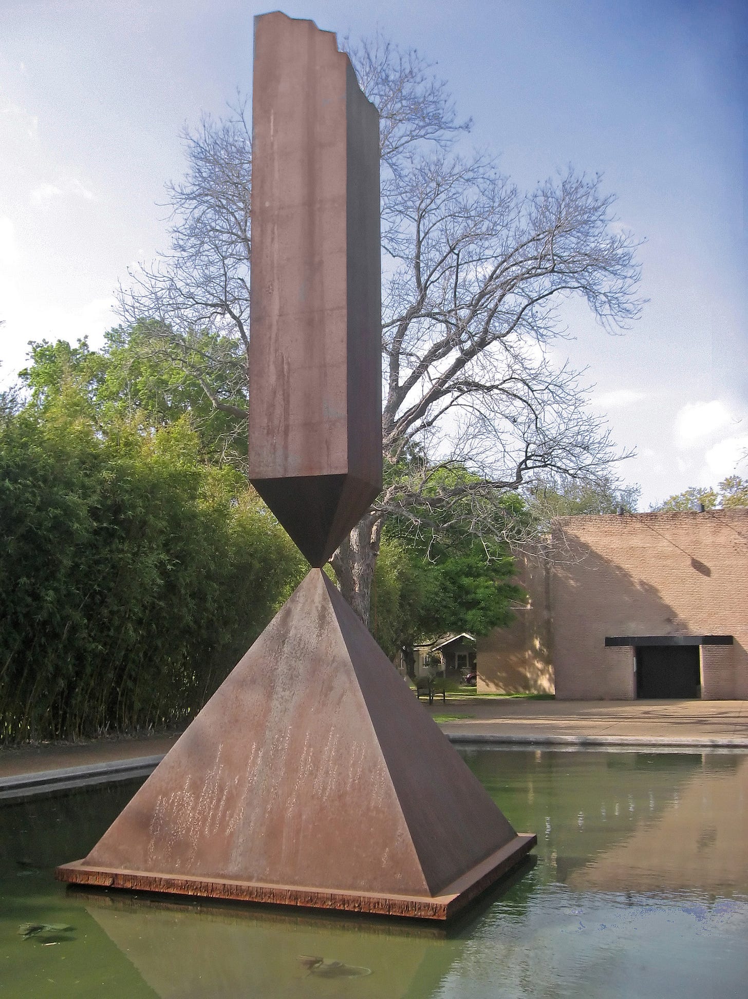
Sculpture in inconvenient. It takes up a lot of space and it therefore difficult to collect. There is a funny quote that is variously attributed to Barnett Newman and Ad Reinhardt: “Sculpture is something you bump into when you back up to look at a painting.” As far as I know, Reinhardt never made sculptures, but Newman did. You can see one of his, Broken Obelisk, in Houston in front of the Rothko Chapel. (And at the University of Washington, at Storm King and at the Museum of Modern Art.)

Admittedly, sculpture can be almost anything now, an idea put forth in the classic essay, “Sculpture in the Expanded Field” by Rosalind Krauss, 1979. The anythingness of sculpture was pushed even further in Thomas McEvilley’s book, Sculpture in the Age of Doubt.

Since 2016, every other year (except 2020) has had a “Sculpture Month” here in Houston featuring a month of sculpture exhibitions at multiple venues across Houston. I want to speak briefly about two of the venues and the sculpture within them. One is a venue I mentioned earlier this week where Nestor Topchy did his performanceThe Silos. Topchy’s performance was part of Sculpture Month (going with the almost infinitely malleable definition of sculpture). The rest of the silos were also used for a variety of site-specific sculptures.

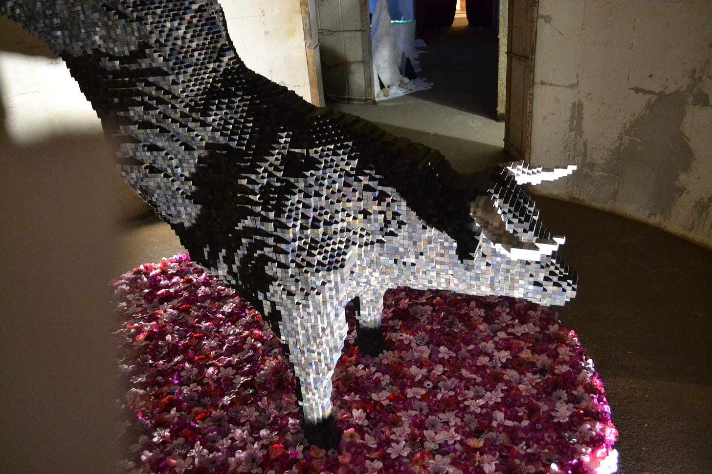
The first one I came across after entering the space was by Shawn Smith called UnNatural Influence, made of plywood, ink, acrylic paint and silk flowers.

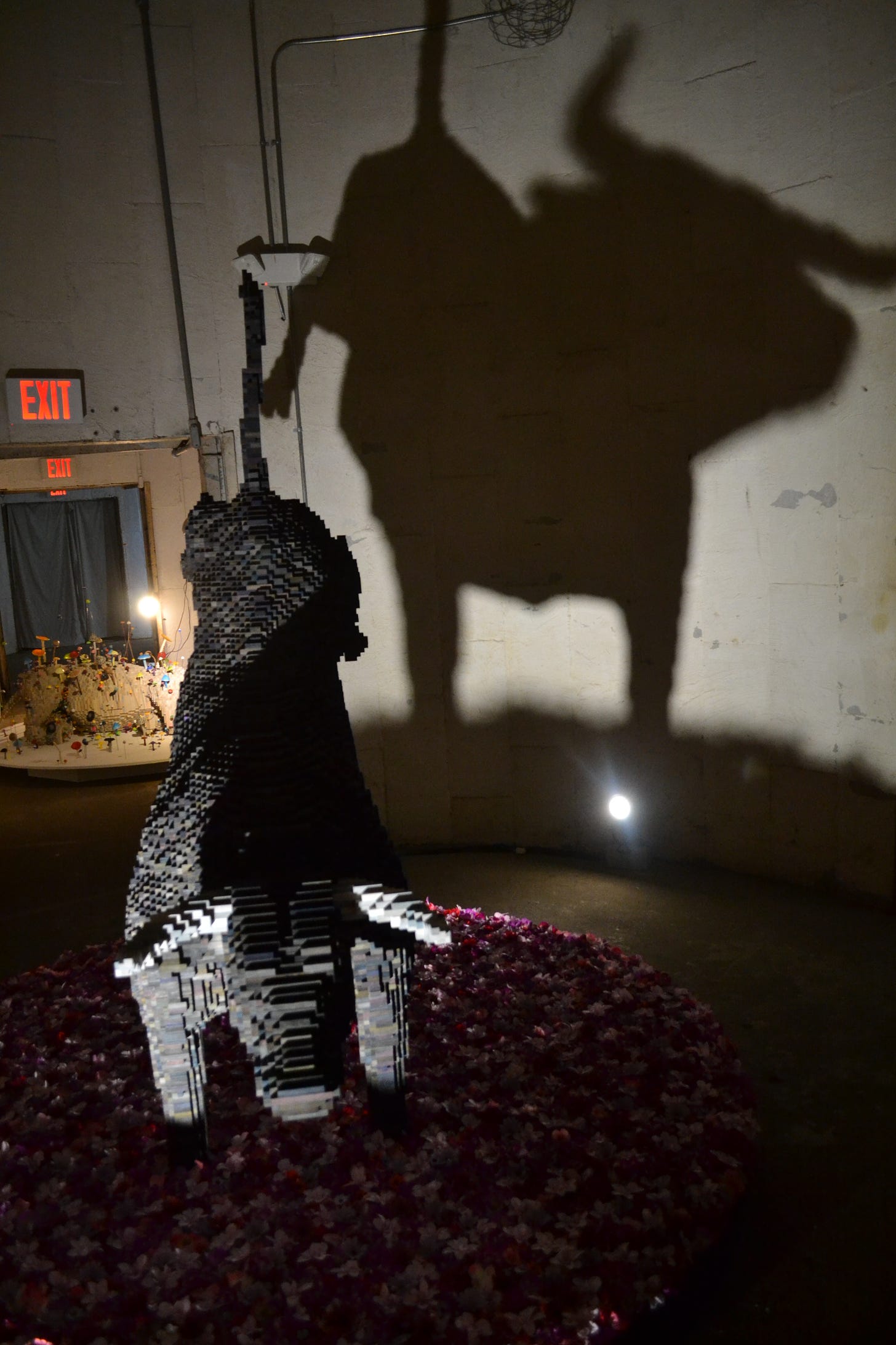
It is a classically Texas subject, a bucking bull, but made out of blocks of wood that imitates pixels. In some ways, this feels like a very traditional sculpture—a single, free-standing object meant to look like a specific thing. Praxiteles would recognize this sculpture, except maybe for the pixelation effect. He would have been most amazed by the artificial lighting effect, which combined with the cave-like interior of the Silos provides a dramatic shadow.

That shadow makes me think of neolithic hunters sitting around a fire in a cave, recounting their hunt for the wild auroch. Aurochs were wild cattle in Europe and Asia that went extinct around 1650. There are depictions of them in cave paintings, including four painted on the walls of the caves at Altamira in Spain. And Altamira is the name of this exhibit, perhaps in honor of cave-like interiors at the Silos.

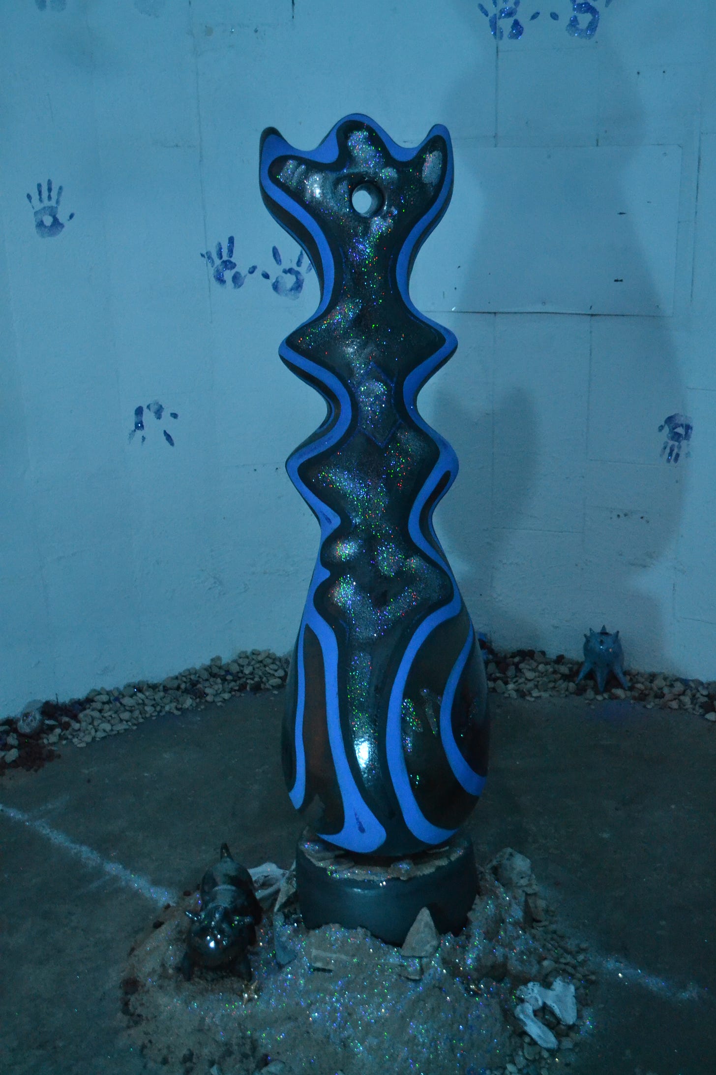
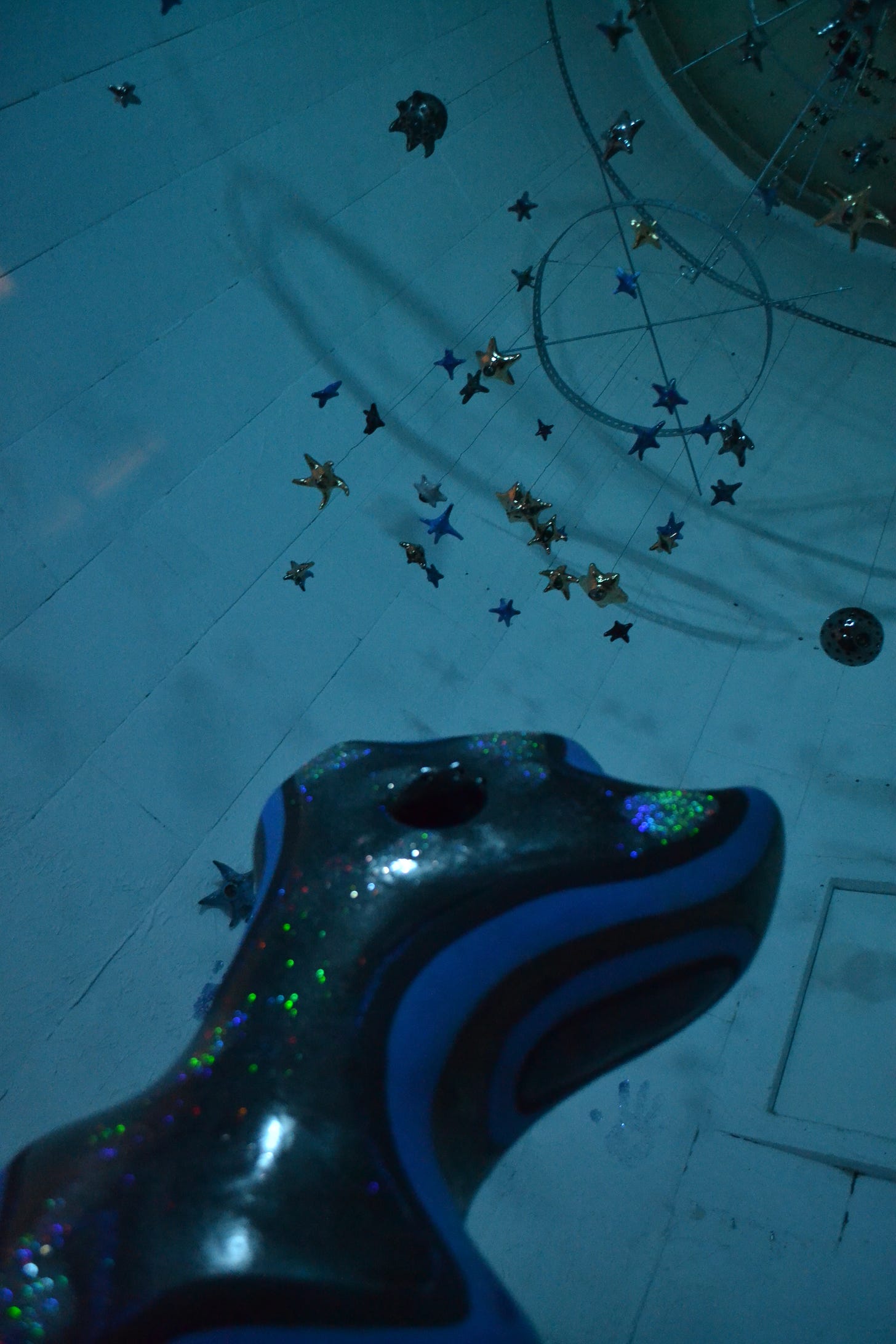
Susan Budge made an installation that made use of the entire silo she had. Stardust features a central object, surrounded by other objects. There is a small floor-level hole in the wall of the silo, into which Budge has placed several ceramic objects and lighted with a warm, incandescent light—in contrast to the dark, bluish light for the rest of the silo. It makes me think of a campfire. Above the central object are star-shaped ceramic figures.

I took them as representing actual stars. In the center of the ceiling of the silo is a large ceramic eye, seemingly gazing down on the scene below. If the theme of the exhibit as a whole is based around our primal need to create as represented by the paintings on the cave wall at Altamira, then what Budge has created perhaps is a depiction of hunter-gatherer types sitting around a campfire with a totem under the stars.

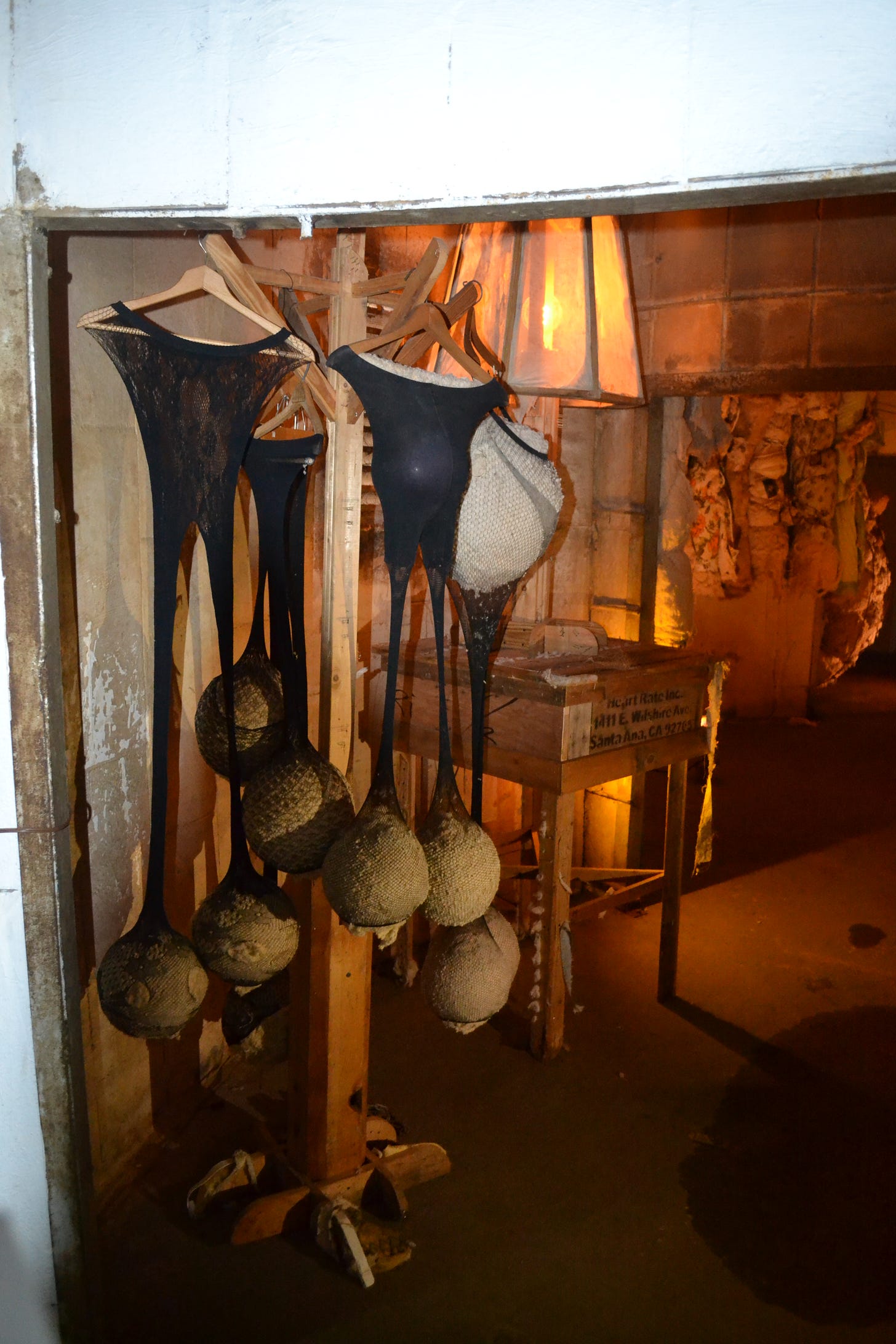
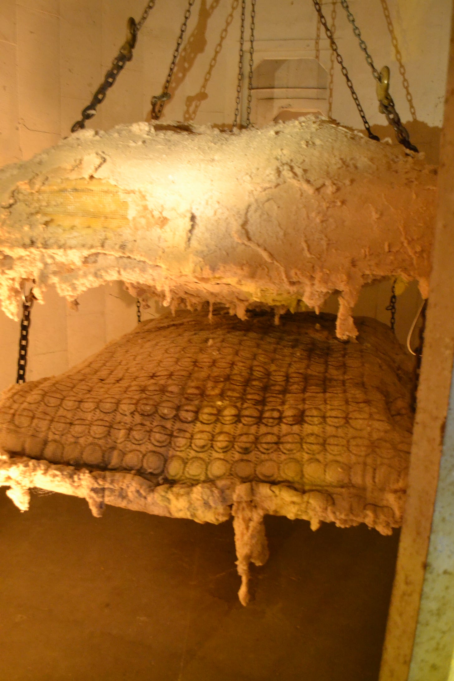
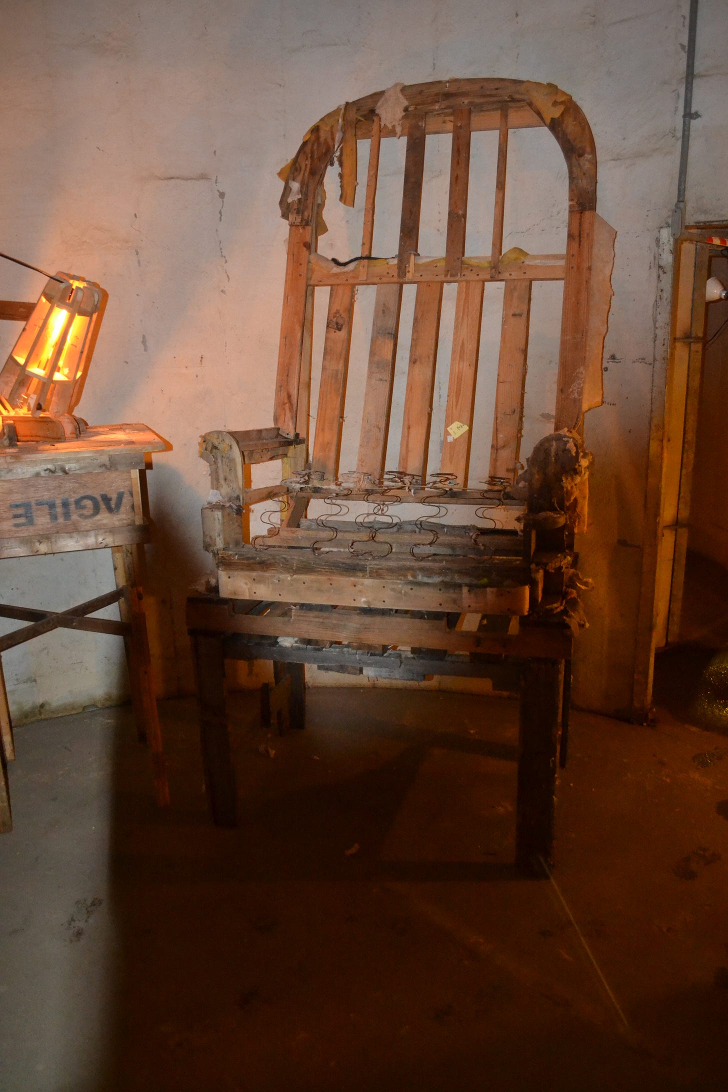
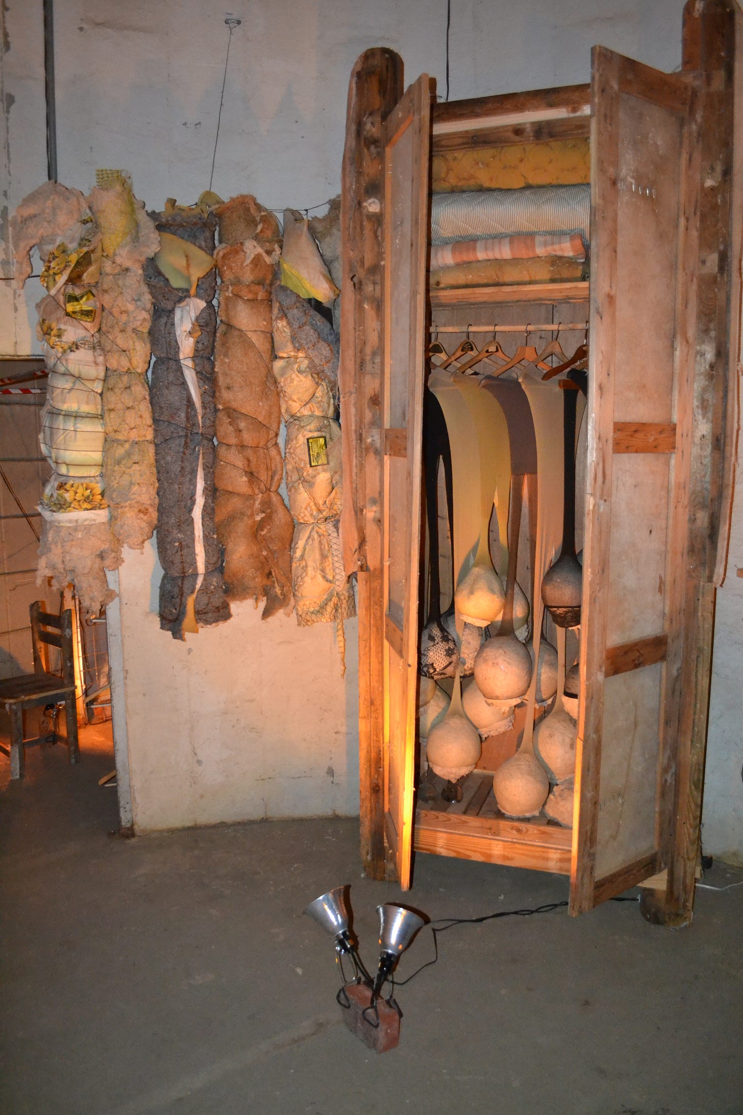
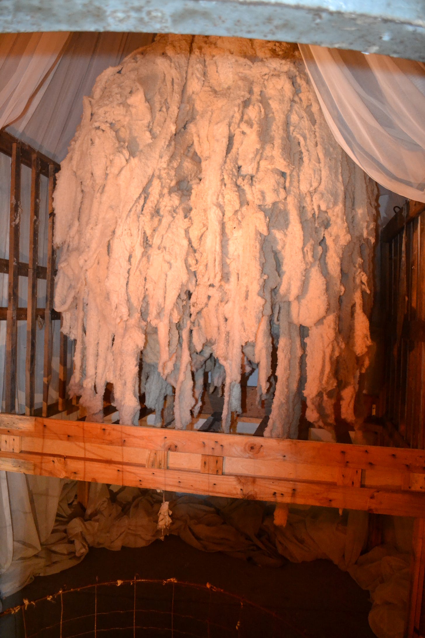
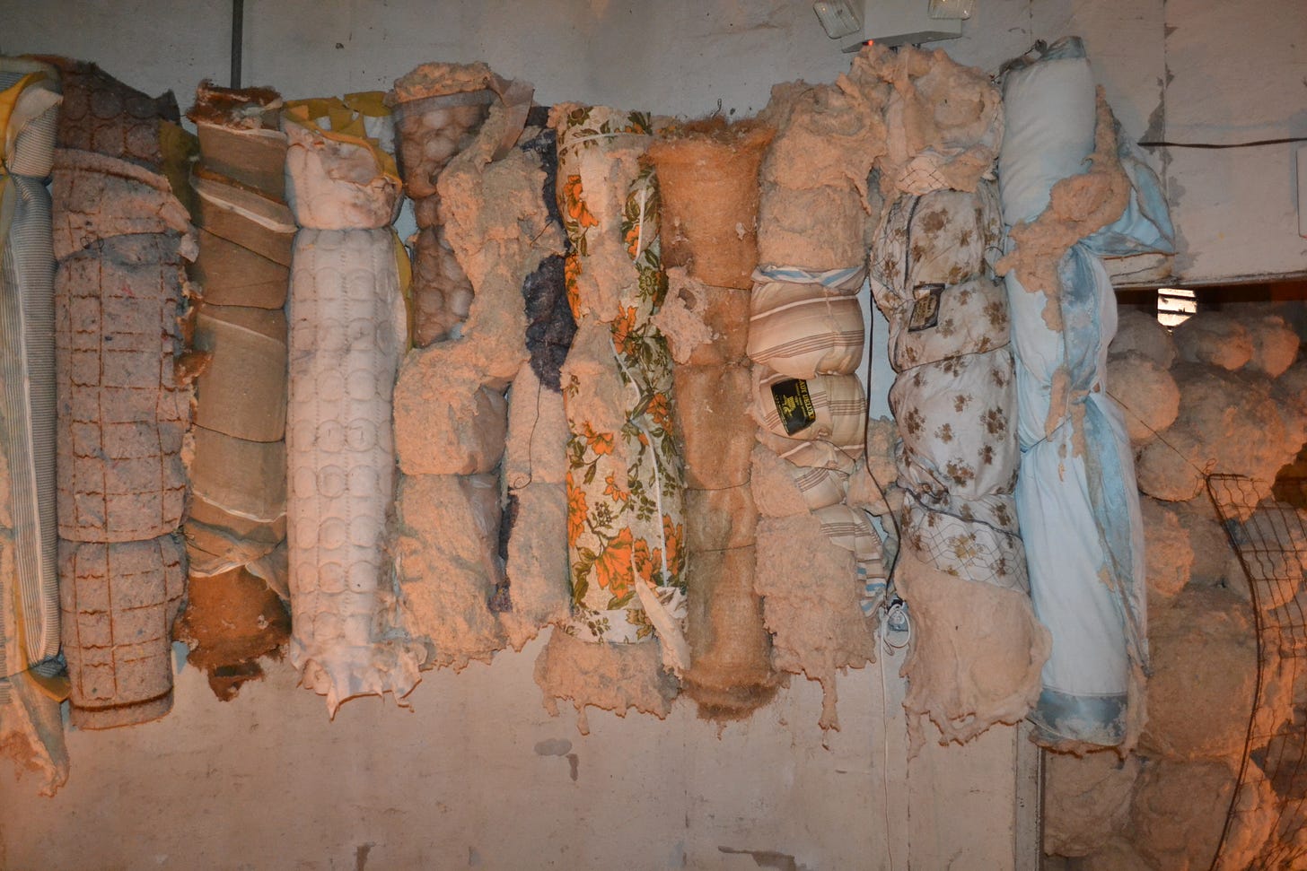
The largest piece was by Kathryn Kelley. Kelley is an artist I’ve written about frequently in the past. Her work always combined a fierce physicality and emotionality and an intellectual underpinning. This probably helps explain why she moved away from the Houston area to get a PhD in studio art. Since she moved, I haven’t seen any new work from her locally, which made me sad. But she’s back for Sculpture Month. This three-part installation is called Disproportionate Dream Fragments, and visually doesn’t seem all that distinct from her earlier work. Instead of using cut-up inner tubes as material, she has found new, grungy recycled material to work with. I always worry that I might catch tetanus from just looking at Kelley’s sculpture.

The rusty bedsprings, the loose nails, all adds up to a somewhat dangerous installation. I know that there are artists who have approached this level of pure grunge, especially assemblagists like Robert Raushenberg, Wallace Berman, Ed Kienholz, and George Herms (some of my favorite artists). And yet, none of those artists has ever given me a feeling of physical menace like Kelley does.

That chair could kill you.

What these photographs utterly fail to convey is the clautrophobic sensation of being in these silos with the work. Kelley didn’t make it easy to breeeze through—you kind of have to squeeze past stuff to see everything. And I hardly need to say that photographing all the work in a given silo is next to impossible.

The installation seems to represent a homey, domestic interior made from scratch by a troglodytic family who only knew about things like beds, chairs, and wardrobes from television images. Their cargo cultic approximations of “home” are dangerous to use and not terribly functional.

Having said this, I suspect that Kelley has a well-thought-out reason for everything, amply backed by theory and with a highly personal underpinning. This has frequently been the case with her earlier artwork. Kelley keeps a blog, but for the past few years, most of her posts have been about why an artist should write. It feels like a very solopsistic project, an artist writing about artists writing. Lots of quotations and excerpts. Her writing is dense and poetic. I was hoping there might be some clues about Disproportionate Dream Fragments there, but I didn’t see any—nothing obvious, anyway.

The other Sculpture Month show I wanted to touch on was also a group show held at the house of sculptor Michael Sean Kirby. I like house galleries and apartment galleries. I couldn’t imagine doing it myself—my tiny apartment is too cluttered. But Kirby’s house is kind of perfect for this, presumbly because he, unlike me, is capable of keeping it tidy. The show in his house was called “After Altamira” and featured six artists. I’m going to mention two, partly because of all the photos I took that night, they had the only ones that came out good. I do want ot give a shout-out to Ronald L. Jones’ unphotographable installation, Cavity. His work, mostly made of webs of yarn stretched over a space, is extremely difficult to photograph.

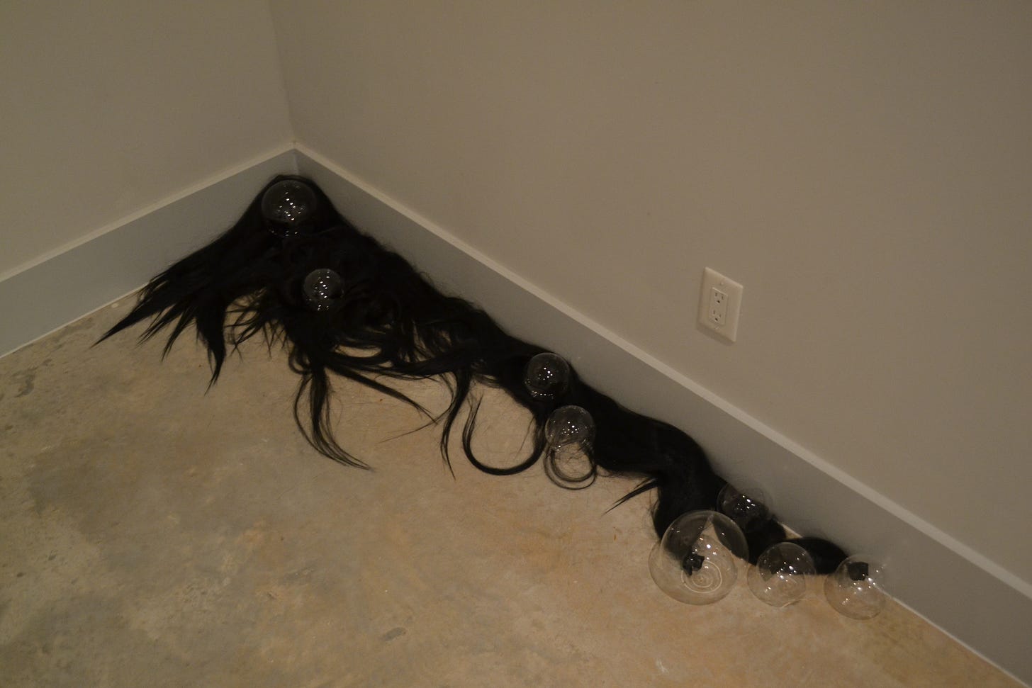
Kamila Szczesna is a Galveston artist who often works with spherical shapes wrapped in stretchy materials. But for this exhibit, the spheres came out of their wrappings. The piece above, interwoven, is made of mouth blown glass and hair. The glass spheres look so delicate, like soap bubbles.

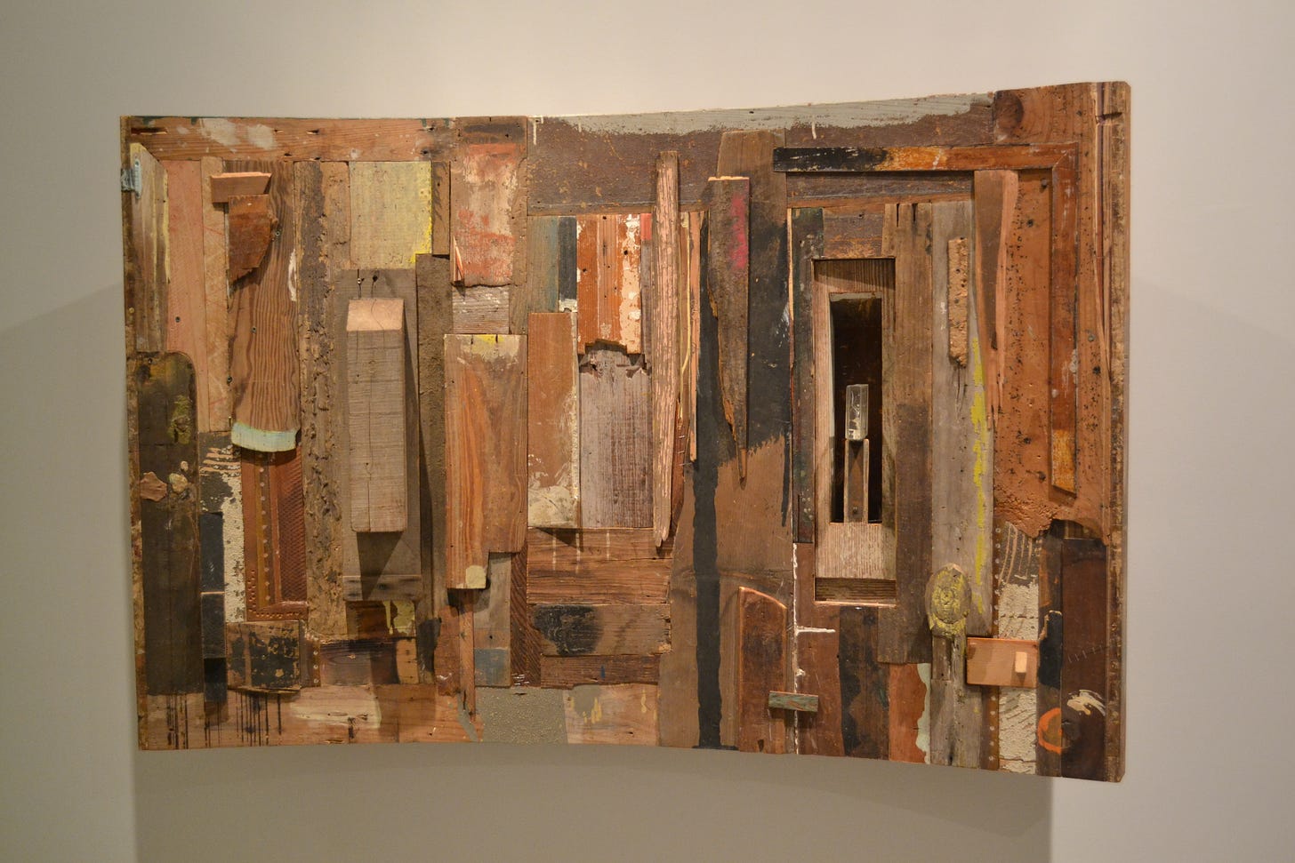
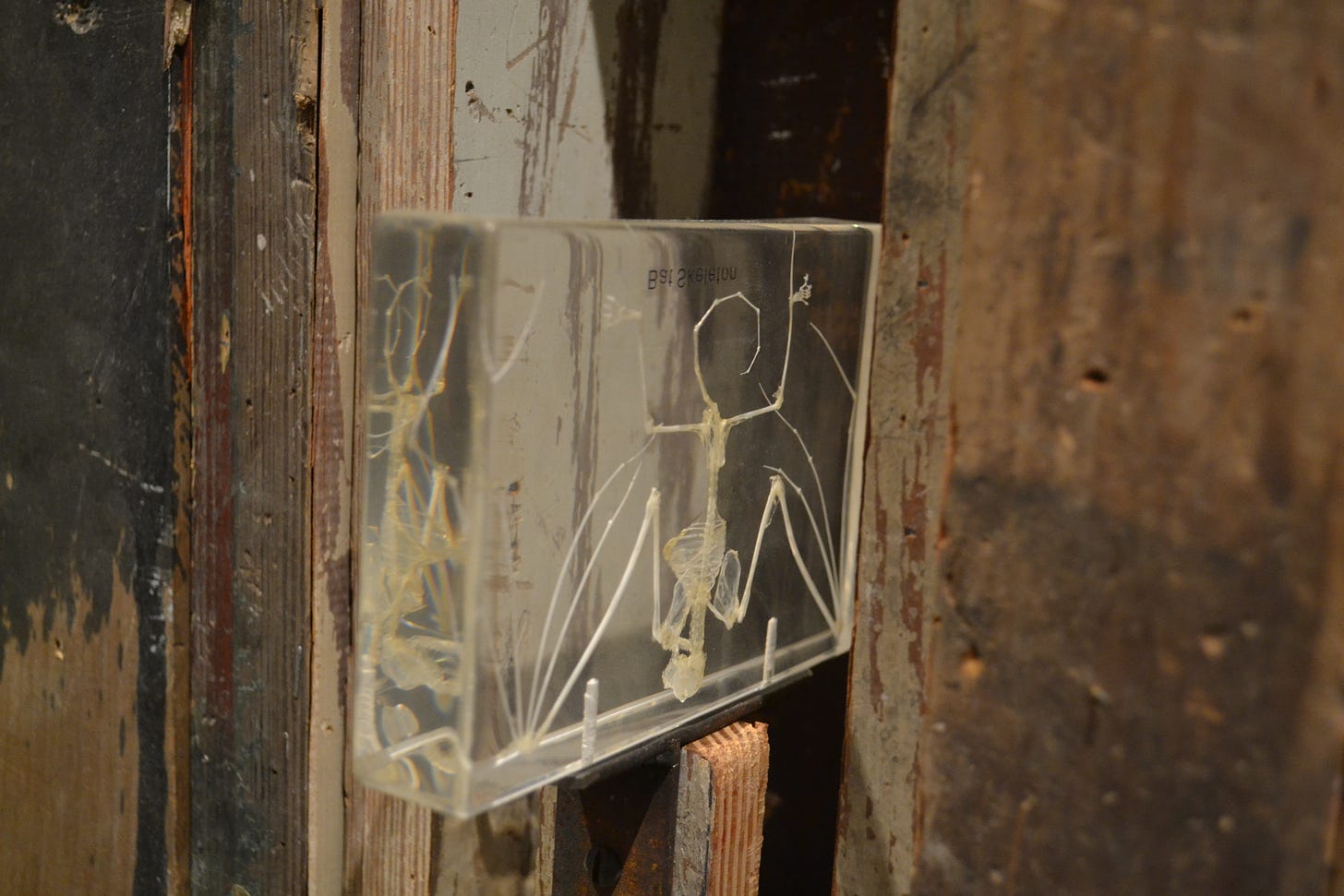
Patrick Renner is an artist I’ve followed for years, writing about his work on my blog and for other publications. His work is closer to the assemblagists I mentioned above than Kathryn Kelly art is—one can certainly see a little George Herms in introvert above. With Renner’s assemblage work, the component parts often have a personal meaning. In this case, they include “the only remaining side of a trick music box my paternal grandfather made when I was a kid” and a “bat house that used to be on my parents’ house.”

The spookiest detail was this tiny bat skeleton encased in acrylic.

Thursday, June 16, 2011

Myke Venable's Big Squares

by Robert Boyd

Myke Venable's art almost dares you to say something about it. It mainly just is. Describing any particular painting in this show is a trivial, unenlightening task.

Photobucket
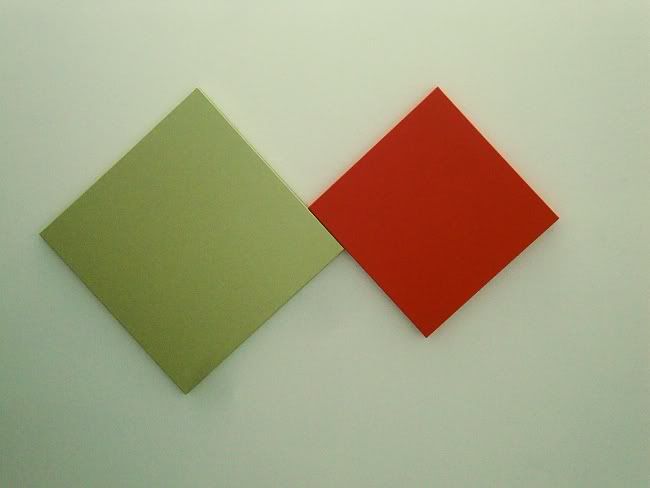
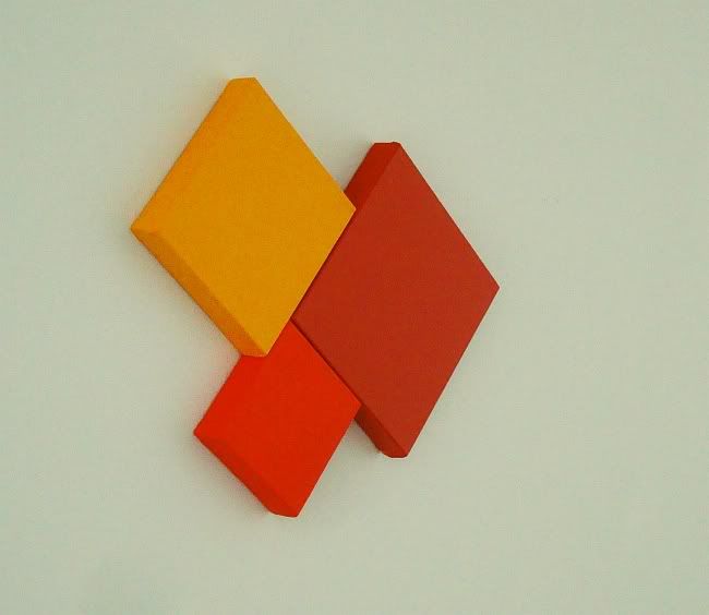
Myke Venable, MV 32 Sage/DD Orange (Dare Devil Orange), latex on canvas, 2011

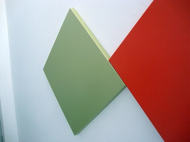
Two square canvases, each hung at a 45 degree angle. the larger one is a pale yellow-green and the smaller one a bright orange. The larger is to the left of the smaller from the viewer's point of view, and the two touch each other ever-so-slightly. Once you've said all this, then what? And Venable doesn't give you anything in the titles. He's not like Barnett Newman, who would give his paintings titles like Achilles or Vir Heroicus Sublimus. Nope, Venable goes for just the facts, ma'am. Each painting is named after the color of paint used.

Photobucket
Myke Venable, MV 32 Sage/DD Orange (Dare Devil Orange), latex on canvas, 2011

These paintings are so minimal that it's reasonable to ask if they are paintings at all. They aren't framed and the colors extend over the edge of the canvas. They have a certain sculptural presence. And if one is an arch-formalist, then flatness and integrity of the picture plane are important indicators that you are in the presence of pure painting. These aren't really flat.

Photobucket
Myke Venable, MV 24 Orange, acrylic on canvas, 2011

If you go into the Gallery Sonja Roesch, it seems designed for "pure painting"--the interior is a big white neutral box. In many ways, it seems like the ideal setting to allow big modernist paintings to just be themselves--no distractions, no visual clutter.

Photobucket
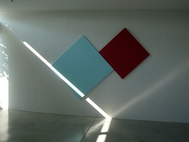
Myke Venable, MV 30 CadRed/Sky Blue, latex on canvas, 2011

It's a totally neutral space except for one thing--it has narrow clarestories on the east and west walls. So early in the morning and late in the afternoon (when the opening for this exhibit occurred), the sunlight will shoot like a laser through the windows into the space. The floor is so highly polished that it reflects the sunbeam back up. The effect of this dramatic light was to highlight the angles on Venable's wall-sized painting MV 30 CadRed/Sky Blue, which was hanging on the north wall of the gallery. So you have a painting that in a dramatic way is in dialogue with the light in the room.

This is a fundamental quality of minimalist paintings, whether Ellsworth Kelly or Agnes Martin or Venable. There is a kind of humility in these paintings, even when they are very large. The humility comes from knowing that they aren't really finished in the studio, but instead only becomes complete in situ--and this last step is not something the artist can fully control.

For example, Venable often uses fluorescent colors in his painting. If a fluorescent color is somewhere where sunlight (which contains ultraviolet light as part of its spectrum) hits it, it will have a kind of glow. But if it is an interior space that only receives artificial light, that glow will be absent. Venable doesn't control the final disposition of the painting--he doesn't know what shadows will be cast on it, what kind of light will be hitting it, etc. This is ironic. These works seem austere and hermetic, but really they depend on engagement with the world to achieve completion.

Photobucket
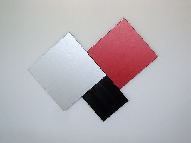
Myke Venable, MV 25 Silver/Scarlet Red/Black, acrylic on canvas, 2011

Photobucket
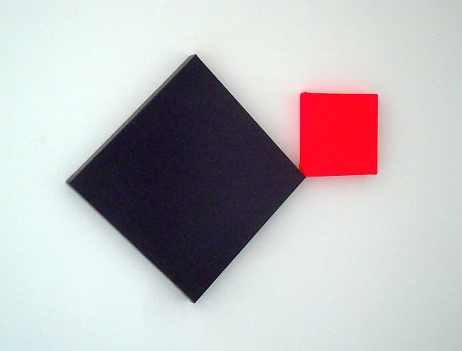
Myke Venable, MV 26 Purple/Fluorescent Pink, acrylic on canvas, 2011

(Author's note: I own two small Myke Venable paintings.)


Share

Wednesday, June 1, 2011

Shaun O'Dell at Inman Gallery

by Robert Boyd

Inman Gallery has expanded; it's huge now, and all the more difficult for an artist to fill the space up. Shaun O'Dell has lots of drawings, which could have been spread out to fill the whole space. But he departed from showing just his drawings and used the new gallery imaginatively.

Photobucket
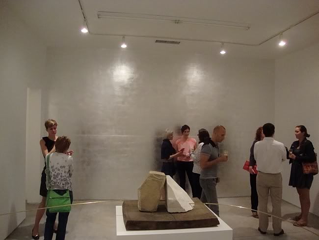
Shaun O'Dell, installation view with Feeling Easy Feelings and Silver Wall, 2011


Feeling Easy Feelings is a sculpture where two rocks (one limestone, one marble) are supporting two long brass pipes, which droop on either side of the rocks like a limp mustache. It was so wide, folks had to squeeze between the ends of the brass tubes and the walls. And then on the wall behind it was Silver Wall.

Photobucket
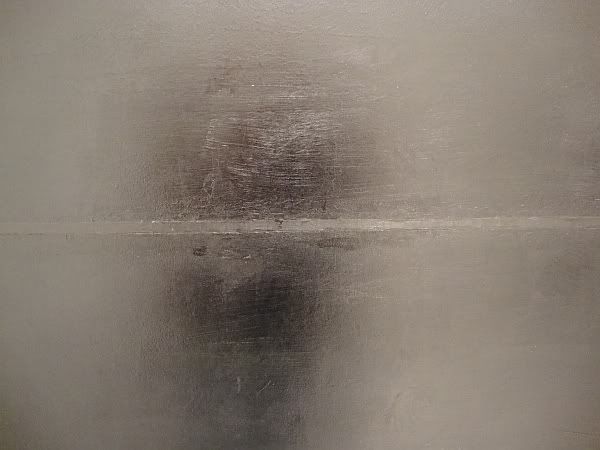
Shaun O'Dell, Silver Wall (detail), aluminum leaf, silver leaf, 2011

This wall becomes kind of a gaudy, sideways Barnett Newman, vibrating between the sublime and the mystical on one hand and the ridiculous and glam on the other. There is even a silver-on-silver "zip" running horizontally across the middle. Like Newman, O'Dell didn't worry too much about getting it perfect. If you look at the edges, you see that they weren't masked.

Photobucket
Shaun O'Dell, Silver Wall (detail), aluminum leaf, silver leaf, 2011

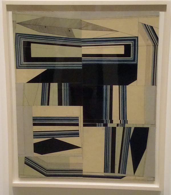
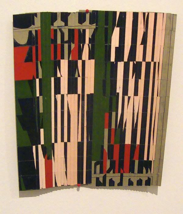
It's not meant to be perfect. The same could be said about the drawings in the show. O'Dell does abstract drawings in gouache and apparently cuts them up and collages them back onto paper. O'Dell has been studying jazz saxophone for a decade, and I see these as improvisations. The drawing before he cut it up was the theme.You could say that the theme on which a jazz musician improvises is "perfect." The improvisation screws it up--but ideally in an illuminating way, a way that reconfigures our whole conception of the theme. (Listen to "Our Favorite Things" by Julie Andrews then the version by John Coltrane, for example.) Here, though, we don't know what the "theme" was. We only see the reconfigured improvisation on it.

Photobucket
Shaun O'Dell, 2nd .Feelings. #5, gouache and ink on collaged paper, 2011

The pieces have a rhythmic feel to them with their groupings of parallel shapes, alternating light and dark. If you know that there's a relationship to jazz, the rhythms will be read that way. They also remind me of Constructivist paintings and some Bauhaus works.

Photobucket
Shaun O'Dell, 2nd .Feelings. #29, gouche on collaged paper, 2011

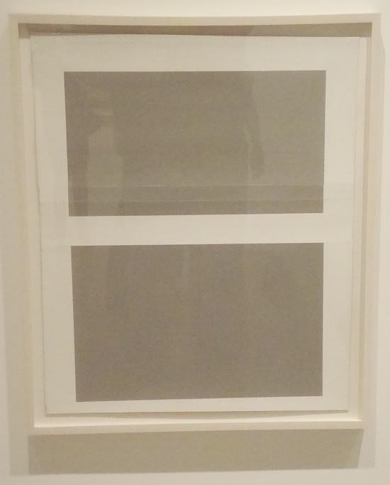
Almost all of the work here is likely to remind a viewer of earlier modernist work. Whether you think that's a good thing or a bad thing depends on whether you think modernism is an unfinished project, as Jurgen Habermas proposed,  or a dead remnant of history. Personally, I agree with Charles Jencks, who, writing about architecture, said that post-modernism meant that the entire history of of art was ours to play with, from the neolithic to the modern. So a silvery sideways Barnett Newman is perfectly allowable, as is a simplified grey Mark Rothko.

Photobucket
Shaun O'Dell, 2nd .Feelings. #14, gouche on collaged paper, 2011

 If you look at O'Dell's website and some of his earlier work, you see that these variations (improvisations?) on modernism are not typical. This seems to be a newish thing for him. But we don't expect artists to do the same thing over and over again anymore. O'Dell's mind and visual imagination are restless and range widely--this is obvious enough by the range of work in this show. What matters is that this exhibit is full of interesting work.


Share


Friday, January 7, 2011

A List of Theoretical Texts to Help Birds be Better Birds

That's what I thought of when I saw the title "A Reading List for Artists" by Rachel Cook in the latest ...might be good.
After finishing a semester of graduate school as a curatorial studies student at Bard College, I’ve realized that there should be a reading list for artists. As a former practicing artist myself with an art school BFA, I wish I had been given a better structural foundation of theoretical texts and art history methodology to complete the picture.
Her list includes some art criticism classics like "Sculpture in the Expanded Field" by Rosalind Krauss and The Anti-Aesthetic: Essays on Postmodern Culture by Hal Foster. And let me say that reading these texts would be very helpful if you wanted to be able to "talk the talk" in 1985. I have my doubts about whether they ever helped anyone make better art, though. A reading list, full of heavy philosophy-influenced post-structural texts like this, seems like the last thing an artist should feel obliged to consume. As Barnett Newman (no intellectual lightweight) said, "Aesthetics is for artists what ornithology is for birds."