Showing posts with label design. Show all posts

Friday, July 20, 2012

It's Mark Flood's World Links

Robert Boyd

 
Dan Colen, Mark Flood, Cameron Diaz

Good grief. I have no idea what to say about this picture of Mark Flood with Cameron Diaz and Dan Colen. ["There’s Something About Mark Flood: Cameron Diaz Turns Up for ‘Hateful Years'," Rozalia Jovanovic, GalleristNY at Observer.com, July 19, 2012]


Henry Moore, Sundial

Sculpture stolen by low-level scumbag. This Henry Moore sculpture, Sundial, was stolen last week. As we all know from Bubbles in The Wire (I get all my information from HBO series), drug addicts steal metal to sell to scrap dealers. Of course, this wouldn't be such a big problem if scrap dealers were honest. I hope no scrap dealer melts down this Henry Moore to sell for a few hundred pounds. But the ones who buy obviously stolen metal from junkies can't be counted on to do the right thing, I suspect. ["Another theft of a Henry Moore bronze," Illicit Cultural Property, July 13, 2012]

Now this is the way to steal art. Don't be a junkie loser--be a criminal mastermind.
A convicted art thief was found by the Brazilian Federal Police to be running an international ring from a prison in Rio de Janeiro, selling stolen art works in neighboring countries, media reports said. Laessio Rodrigues de Oliveira, who studied information science, began serving a 12-year prison sentence in 2007 for stealing and falsifying art works, the Folha de Sao Paulo newspaper reported on its Web site. The 39-year-old Rodrigues de Oliveira has been running the ring from the Bangu prison in Rio de Janeiro. ["Brazilian masterminds art thefts from behind bars," Fox News Latino, July 16, 2012]


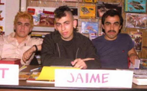
Gilbert, Jaime and Mario Hernandez in the early 80s

Jaime Hernandez channels Joe Brainard. Here are some of Love and Rockets artist Jaime Hernandez's memories of San Diego comic con, which he has been attending since the early 80s (when mohawks were still shocking).
3. I remember when I could drive there without traffic.
4. I remember when our comic debuted.
5. I remember when I met Daniel Clowes, Peter Bagge, etc…
6. I remember when the celebrities were comic artists.
["Comic-Con memories: Jaime Hernandez on San Diego’s days of ink," July 17, 2012, The Los Angeles Times
I remember when Jaime Hernandez was an ass-kicking young punk redefining comics, as opposed to a crotchety but brilliant old master. (I was thin and had lots of hair back then).


re:design (Eurydyka Kata & Rafał Szczawińsk), 2012

Guess the painter. I really love these iconic portraits of famous painters by re:design (Eurydyka Kata & Rafał Szczawiński). Most are pretty easy to guess, but a few made me scratch my head. [Hat-tip to This Isn't Happiness]


re:design (Eurydyka Kata & Rafał Szczawińsk), 2012


Wednesday, March 7, 2012

Dale Yarger RIP

by Robert Boyd

Dale Yarger was a graphic designer who was an important figure in the cultural scene in Seattle for decades. He designed the original Sub Pop logo before it was even a record label. Bruce Pavitt (one of the two founders of the label) wrote a column for The Rocket, a music newspaper which Yarger worked for. The way I heard it (and if anyone knows better, please feel to correct me--I'm relying on my extremely imperfect memory here), Yarger designed the logo with "SUB" above "POP" and little arrows between the letters, and then it was slightly changed when they made it the official record label logo.

When I think of a city's cultural scene, I rarely think of the graphic designers as being a particularly prominent part of it. (Sorry all you graphic designers out there!) But in Seattle, graphic designers with strong, individual styles were quite important to how Seattle expressed itself. Helene Silverman, Art Chantry and Dale Yarger were probably three best known designers, and The Rocket was where they made their mark (although they worked with other publications, as well as doing posters, etc.). Seattle was a good place for a designer to shine for two reasons. First, the music scene afforded lots of opportunities to design posters, flyers, etc. (And these were the kind of things that people saved and remembered.) Second, there were many local publications--The Seattle Sun, The Seattle Weekly, The Rocket, The Stranger, and hip local publishers like Real Comet Press and Fantagraphics Books.

I got to know Dale when he worked for Fantagraphics. He got hired shortly after I did. I think he was tired of the freelance life and looking for a change of scene when he came aboard as art director, He was massively overqualified for the job.Being designer for Fantagraphics was a labor intensive job. Not only did he have to design zillions of book covers, he had to design pretty much every single page of The Comics Journal--and that's a lot of pages. (By the time I left, the art department consisted of Dale at Art Director along with Pat Moriarty, Jim Blanchard, and Roberta Gregory. Design interns over that period had included Stefan Dinter, Jason Little and Jason Lutes.)

Fantagraphics through its first few years had pretty terrible design. It started to improve when Yarger's predecessor, Dale Crain, became the art director (he went over to DC to become their book designer). When Yarger joined, he redesigned everything from scratch. Some of his favorite things were using duotone, blowing images and type up to give it a ragged look, and taking black-and-white line art and using it as halftone.

Here are a couple of projects we worked on together. The Best Comics of the Decade:1980 to 1990 was  sort of a manifesto. The 80s had seen an explosion of new art comics, but it was quite scattered. We wanted a book that would provide a decent sampler of this work for the person who didn't have the wherewithal to seek out the original publications--which would have been quite hard. But more importantly, we wanted to say that the art of comics exists not in the assembly-line-produced corporation-owned comics of Marvel and DC, but in alternative comics, experimental comics, highly personal comics, etc.We had work by 62 cartoonists. For some reason, we decided to publish it in two volumes. (Perhaps we thought published a single 248 page volume would have been asking too much from our customers, who were used to paying a buck for a comic book. Things have changed a lot since then.) So we commissioned five artists to draw us four pictures of some of their iconic characters. (Gilbert and Jaime Hernandez collaborated on a drawing; the others were by Robert Crumb, Bill Griffith and Matt Groening.)

But the challenge was to somehow indicate that there were a lot more cartoonists in each volume. Here's how Dale did it.


The Best Comics of the Decade volume 1, front cover. Illustration by Bill Griffith. Art direction by Dale Yarger. 1990


The Best Comics of the Decade volume 1, back cover. Illustration by Matt Groening. Art direction by Dale Yarger. 1990


The Best Comics of the Decade volume 2, front cover. Illustration by Jaime Hernandez and Gilbert Hernandez. Art direction by Dale Yarger. 1990


The Best Comics of the Decade volume 1, back cover. Illustration by Robert Crumb. Art direction by Dale Yarger. 1990

You can see behind the figures in the foreground are a grid of images. These are images by the other contributors, taken from their published work. By reproducing them in a halftone (as opposed to the black-and-white line art that they originally were), Yarger made them recede. They become part of the pattern behind the central figure.

Now all you younger designers might be thinking, big deal? Aside from this being an elegant solution, keep in mind that these covers were done before Quark, before Photoshop, etc. The desktop publishing revolution was just around the corner, but it hadn't hit Fantagraphics yet. So that means that he shot each of those images with a stat camera, cut out the parts he wanted by hand, waxed them (so he could paste them down), and pasted them on a sheet of clear plastic, which he then attached to an lay-out board with a tape "hinge" and instructions to the printer to print this layer in black at 30%. And that was just one of the many hinged overlays he created for this cover. (The text that reads "1980-1990" for example was not typeset--Yarger hand-cut those numbers out of a rubylith overlay.)

Now after we published this, Seattle's Center on Contemporary Art approached us to curate an exhibit of comics art. They could see that we were doing something different with comics--treating it as an art form. We decided to build on the Best Comics of the Decade, doing a group show primarily consisting of the artists in the books (a few were changed, but the two projects mostly overlap). I helped curate the show and I edited the catalog. Again, Yarger was the Art Director, and we worked closely together on it.


Misfit Lit. Front cover illustration by Dan Clowes. Art direction by Dale Yarger. 1991

Yarger was enthused about this project. In fact, he came up with the name of the exhibit. One afternoon we were brainstorming names. Yarger went off to his drawing board and tossed out a dozen or so names, including "Misfit Lit". Then he created a logo for the show that I think works great. Each letter is a piece of hand-drawn display type from a cartoonist included in the show. (This is his way of indicating visually that this is a group exhibit.) Yarger gives the logo a kind of urgency by leaning each letter to the right--the logo threatens to tumble off the page.


Misfit Lit. Back cover illustration by Carel Moiseivitch. Art direction by Dale Yarger. 1991

The interior consisted of an essay by Robert Rodi, a brief oral history compiled by me, and biographies of all the artists. Yarger designed all the pages. One completely weird (but typical for Yarger) thing he did was to spell out the page numbers and place them almost randomly in the top of the page.


Misfit Lit page 29. Art direction by Dale Yarger.

This page works especially well because of the two pieces of art Yarger chose. Unlike a regular exhibit catalog, we felt it was OK to use art that wasn't strictly in the show. It was meant to be an example of the artist's work. But the combination of the evil character calling you, the reader, a "Sucker" juxtaposed with the Michael Dougan face hysterically laughing was perfect.


Misfit Lit page 25. Art direction by Dale Yarger.

Here, Yarger blows the page number up so much that you can see the imperfect edges, and then goes further by letting it hang off the side of the page. This was the kind of design craziness he would do if given half a chance. It was a beautiful thing.

Dale died Saturday after a long battle with cancer. Dale was a great co-worker, collaborator, mentor and friend when I worked at Fantagraphics. His work for Fantagraphics is just a small part of his life's work. You can see more at his portfolio website and at his Facebook tribute page.


Share

Monday, October 18, 2010

Diem Chau at Peel Gallery

There is a category of art that I call "stunt art." It's art where the artist has done something so unlikely that you can't help but be impressed, whether or not the art is really good. Samuel Johnson said, "Sir, a woman's preaching is like a dog's walking on his hind legs. It is not done well; but you are surprised to find it done at all." We'll leave behind Johnson's 18th century notions of women; stunt art is to art like a walking dog is to great dancer. You are impressed with stunt art, but if you think too hard about it, you start doubting its value as art. A good example of stunt art would be the pencil lead sculptures that seemed to be sent all over the internet recently. 


So given this forthright condemnation of stunt art, I am chagrined to admit how much I like Diem Chau's carved crayons.


Diem Chau,Diem Chau
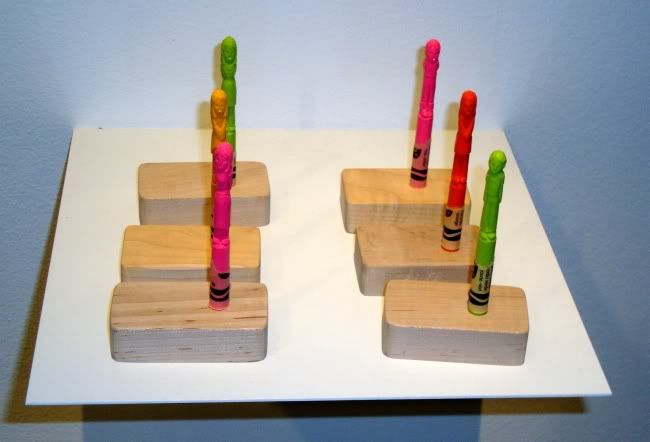
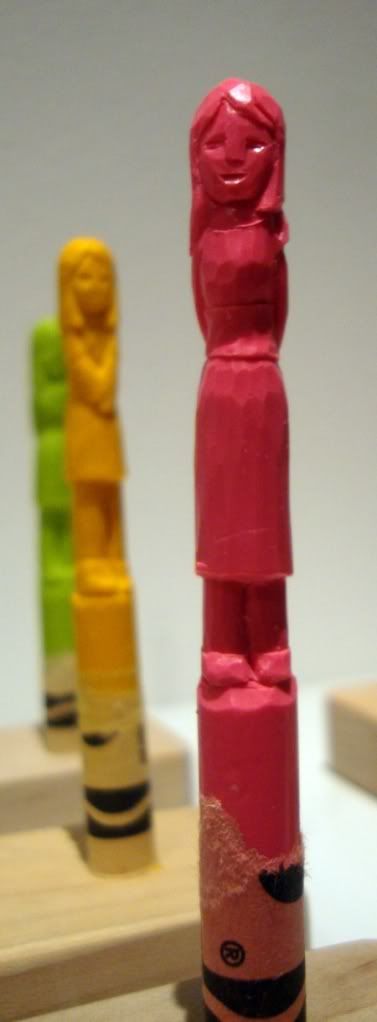
Diem Chau, untitled, carved Crayola crayon


Diem Chau,Diem Chau
Diem Chau, untitled, carved Crayola crayons

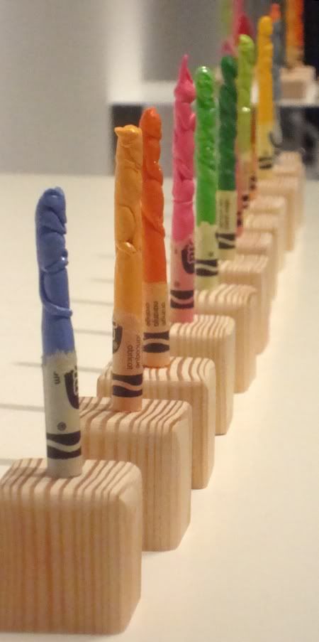
There is something appealing about Crayola's colors, and these tiny totems (any relation to her home in Seattle?) seem so fragile, so cute. 

Diem Chau,Diem Chau
Diem Chau, untitled, carved Crayola crayon

Diem Chau,Diem Chau
Diem Chau, untitled, carved Crayola crayons

I think it was easy for me to forgive her for being a stunt artist because some of the other art she had in the show. 

Diem Chau,Diem Chau
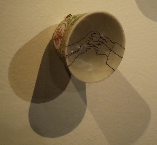
Diem Chau, Offering, porcelain cup, silk organza


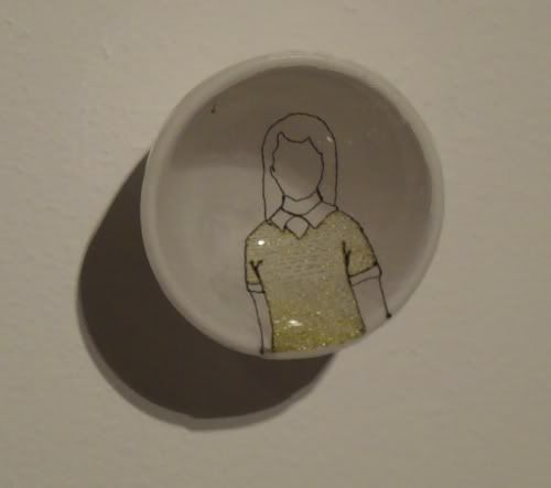
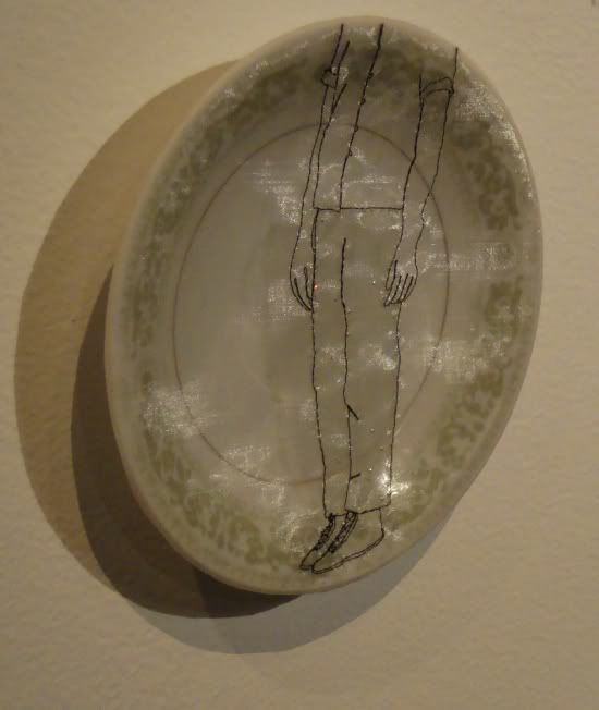
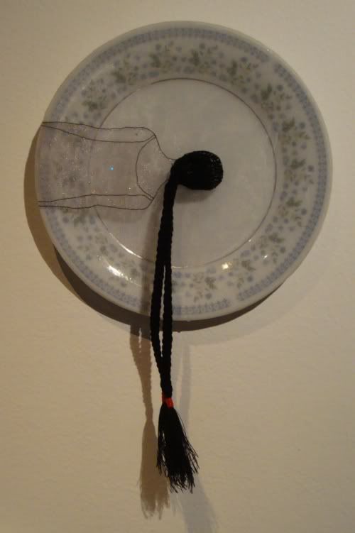
These other works consist of porcelain plates and cups, over which an embroidered silk scrim is stretched. The embroidery is usually a line drawing of part of a person (the whole figure is never visible), looking casual and ordinary.


Diem Chau,Diem Chau
Diem Chau, Girl, porcelain plate, silk organza

Chau's drawings are clear and concise, leaving out as many details as possible while still being completely recognizable. Their spareness and the casualness of the presentation belies the high level of craft involved.

Diem Chau,Diem Chau
Diem Chau, Linger, porcelain plate, silk organza

What does this aesthetic--high craft mixed with a casual matter-of-factness--remind me of. I think one can look at certain modern comics artists, like Gabrielle Bell or many of the artists published in Mome. I think one can find work that operates similarly on Etsy. It's an approach I like a lot. This work has the kind of homey beauty that you think of grandmothers creating--needlepoint samplers, quilts, etc. It is art with a comforting domesticity.

Diem Chau,Diem Chau
Diem Chau, Float, porcelain plate, silk organza

As this was Peel Gallery, there was also something semi-useful for sale. Instead of their usual jewelry, which I don't have enough interest in to be able to judge, they had stereo speakers. Weird, huh? Something for all you audiophiles/design lovers.

Joey Roth,Joey Roth
Joey Roth, ceramic speakers and amp, 2009


These speakers not only look cool, but they crank pretty good, too. Joey Roth got other designers to make their own versions of his speakers, which were pretty interesting too.


Matthew Waldman,Matthew Waldman
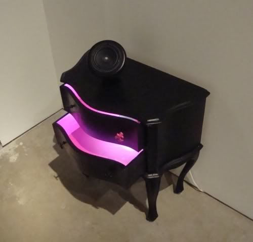
Matthew Waldman, wood, fluorescent lamp, paint, porcelain speaker, 2010


Sruli Recht,Sruli Recht
Sruli Recht, cardboard speakers, 2010


I'd love to have those cardboard babies. But I figure that to own these, you have to have a huge space, and it has to be interior designed within an inch of its life. There are a few mod houses here and there where that would work--not mine though. I live is a cluttered space where books and art fight it out for existence. Still, those are some handsome speakers...

Thursday, July 1, 2010

Two Abecedaria

According to Wikipedia, an abecedarium is "an inscription consisting of the letters of the alphabet, almost always listed in order. Typically, abecedaria (or abecedaries) are practice exercises." Related is an abecediary, which they define as "the full alphabet carved in stone or written in book form, historically found in churches, monasteries and other ecclesiastical buildings." A modern abecedarium could be anything made out of the letters of the alphabet. By a bizarre coincidence, I encountered two very different abecedaria recently.

Roeland Otten
Roeland Otten, ABChairs, laminated MDF, 2010

I saw these on Art Milk (a great blog that everyone should subscribe to). They don't look terribly comfortable, but aside from that they are totally cool. There is a lot more information and many more photos of the chairs on Roeland Otten's website.(And while you are there, you can listen to--and download--his collection of "afrobot" music.)

Roeland Otten
Roeland Otten, ABChairs letter b, laminated MDF, 2010

Then I got Abecederia from an English design-oriented publisher, Nobrow.

Blexbolex
Blexbolex, Abecedaria, picture book, 2009

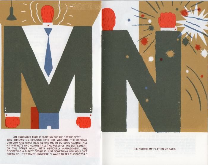
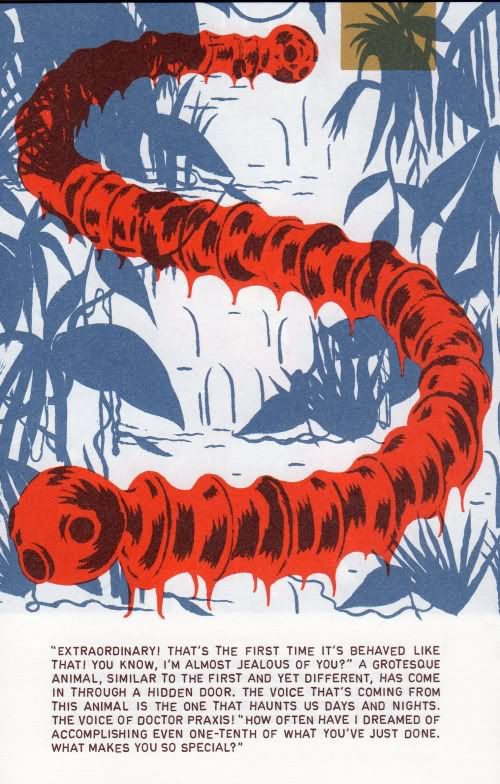
The title refers to a place--a kind of slave labor concentration camp in an African country. But the book is also an abecedarium. Each page has a large illustration in which a letter of the alphabet forms the main design element.

Blexbolex
Blexbolex, Abecedaria pages 16 and 17, picture book, 2009

The book has the form and the style of a children's book. But the grim, violent, and frankly disturbing subject matter tells a different story. Two robbers rob a bank, then escape into the jungle to the "colony" of Abecedaria. In it, a German scientist is doing unspeakable experiments on his enslaved prisoners (including our "heroes"). He does this with the apparent connivance of the dictator of Katagonia (which in my mind I thought of being like Zaire under Mobutu, but there are distressingly many possible models). The scientist, Dr. Praxis, has discovered a crash-landed alien, which it is studying--until the alien gets frisky with the narrator.

Blexbolex
Blexbolex, Abecedaria page 22, picture book, 2009

Blexbolex is the pen-name of French cartoonist and children's book illustrator Bernard Granger. A couple of his books have been published in English by Nobrow, and one of his children's books, Seasons, has been published in English by Gecko Press. Nobrow also published preliminary sketches for Abecedaria, if you are interested in seeing a little of Blexbolex's process. The end result is something stylish and nostalgic, reminding one of children's books from the '60s. This is in bizarre contrast to the grim and lurid story.

I like to imagine someone sitting in one of the ABChairs reading Abecedaria. Perhaps Otten and Blexbolex should team up to cross-promote their respective abecedaria.

Sunday, March 7, 2010

Parking Lot Modern

Wacdesignstudio (Jenny Lynn Weitz Amare-Cartwright and Scott Cartwright) staged a rather forlorn event alongside the North Freeway in the deserted parking lot of Landmark Chevrolet. It was a "guerrilla furniture sale." The furniture--mod wooden laminates--wasn't the most comfortable (definitely not for older folks who might find it hard to rise from floor level chaise lounges). It sure looked nice, though.

Here is my fuzzy photo of the event, taken with my camera phone.

wacdesignstudio

I think they were trying to make some kind of statement, there among the many closed businesses and among the myriad discount furniture outlets (Gallery Furniture most prominently). Standing in that wind-whipped parking lot, I wasn't sure what the statement was. Except maybe--we're here!

Wednesday, October 15, 2008

Tadanori Yokoo

Ok, enough with the politics. Time for a pure visual coolness break.


The Wonders of Life on Earth


Yakuza Movies (1968)


Sleep, Crime and Falling (1965)


See lots more by this Japanese poster artist at Journey Around My Skull, a great blog about avant garde books and graphic art.