Showing posts with label photography. Show all posts

Tuesday, January 15, 2013

Shipwrecks and Other Moons

Robert Boyd

One could, on seeing Ted Kincaid's photos at Devin Borden Gallery, be tempted into a conversation on the authenticity of photography. But that conversation would be old hat. What interests me is that these highly manipulated images are not obviously double-coded. They aren't images of things and about being images of things. They generally lack irony.


Ted Kincaid, Shipwreck 712, 2012, digital photograph on Hahnemühle photo rag pearl, 22x30"

This misty, seemingly faded image of a shipwreck is meant to be seen as an image of a shipwreck. In the 18th and 19th century, people who lived in coastal towns probably knew of people who had been in shipwrecks or had witnessed shipwrecks themselves. It was a popular subject of paintings--J.M.W. Turner painted more than one shipwreck, for example.

For a modern person, however, shipwrecks are extremely uncommon (notwithstanding the Costa Concordia). And the image of a foundering schooner like Kincaid's Shipwreck is likely to evoke nostalgia more than, say, sublime terror. One might think about Turner or Géricault, Ernest Shackleton or Patrick O'Brien's The Thirteen Gun Salute. But what we know looking at this picture is that it is meant to represent the past. The only irony in the work is that it uses modern technological methods to depict the past. Otherwise, it is simply what it seems--a romanticized image of shipwreck, laden with all the symbolism such images suggest (mortality, futility, the power of nature, etc.).


Ted Kincaid, Stormy Sea 807, 2012, digital photograph on Hahnemühle photo rag pearl, 22x30"

Kincaid's show is called Earth, Sea and Sky. Stormy Sea and Shipwreck are the two "sea" pictures. There are several landscapes, which are similar to the nautical pictures in their sense of nostalgia. Kincaid's landscapes aspire to be simultaneously gothic and sublime, and therefore to recall late 18th century/early 19th century literature and art.


Ted Kincaid Earth Sea and Sky installation view.

But the oddest and most original pieces in the show are his series of Possible Moons.


Ted Kinkaid, Possible Moons

These moons float in miasmal space. Indeed, they seem suspended in some unhealthy medium quite unlike the cold vacuum of outer space. Of course, this is also nostalgic. Until the early 20th century, scientist believed there was a medium in space called ether.


Ted Kincaid, Possible Moons 1011, 2012, digital photograph on Hahnemühle photo rag pearl, 20x16"

 These moons are mysterious and somewhat threatening. The antique look of the images might make one think of early science fiction--more H.G. Wells with his sinister plots (see First Men in the Moon, for example) than Jules Verne.


Ted Kincaid, Possible Moons 1010, 2012, digital photograph on Hahnemühle photo rag pearl, 20x16"

It used to be an insult to refer to pictures as being literary. Being so described was to suggest that the art in question betrayed its essential nature. But I think the infinitely manipulable nature of digital photographs puts paid to such notions of essentialism. To say then that a work is evocative of some older literary source or genre is no insult. The only issue then is whether it does this well or poorly. I think Kincaid's images do it very well. But they shouldn't be hanging on the white walls of a modern gallery. They should reside in some wood-paneled library whose owner retires there to read 18th and 19th century literature (perhaps The Castle of Otranto or Wuthering Heights) on his Kindle.


Share

Monday, November 19, 2012

Sometimes a car is just a car (Not!)

Dean Liscum

Debra Barrera's Kissing in Cars, Driving Alone at Moody Gallery is the sexiest show that I've seen so far this year.

Bar none.

Yet there are no full frontal nudes, no orgiastic tangle of limbs, no burnished cocks or plush pussies rendered in photo realist detail on a monumental scale. It's just automobiles: paraphernalia, drawings, parts.
Jeff Koons would be very, very disappointed.

Let me explain what I mean by "sexy" because it's both a powerful word and also a very personal one that tends toward ambiguity. In other words, your "sexy", my "sexy", and Mitt Romney's "sexy" might not match up. (Although magic underwear may be the garment that binds our "sexy" together.) For me, "Sexy" is mental. It's a state of mind. It's an approach and an attitude that focuses on the minutiae to the point of obsession. And I'm not just talking about the physical details. I'm also referring to the symbolic, the psychological, the political, the social, and the metaphysical details that compose and converge into an art work.

If the devil is in the details, my version of "sexy" is the devil's devil.

Barrera's approach to the automobile--how she handles it, how she represents it--makes me swoon. And partly because cars are the perfect metaphor for life in the U.S. As a symbol they represent freedom, sex, and death, making an emotional connection as well as serving as a signifier. For I suspect, regardless of where you misspent your youth, chances are that you either had your first sense of adult autonomy or had your first sexual experience or your first encounter with death in an automobile. Or all three.
Barrera leverages that symbolism in her sensual and reverential treatment of cars. It's most obvious in her photographs of the personal detritus that she salvaged from wrecks. She collected personal belongings left behind in wrecked cars and beautifully photographed them in a way in which each subject becomes an objects d'art and also a visual, narrative poem: a clutch of red balloons, a rusting tiara, a molding precious bible. The 8" x 10" frames each contain an entire life's story. They invite you to imagine them.


Debra Barrera, Balloons, 2012, archival inkjet print, 8" x 10 5/8"


Debra Barrera, Precious Moments Bible, 2012,  archival inkjet print, 8" x 10 5/8"

The sensuality comes through in her drawings of cars. The detailed graphite renderings of the cars reminds me of fellow Moody Gallery artist Michael Bise. The suspension of the subject and the drawings lack of mundane contextual details suspend the subject and elevate it to an ideal, similar to the drawings of Robert Pruitt. Where as his stark presentation of his subjects force you to confront his blend of ethnic and social and political symbols and stereotypes, Barrera's sports cars read as an erotic ideal. Each one is a petite mort, distilled from time and space, complete and unending within the confines of the frame as if within an evening of making love. The timelessness is evident in Circuit (Mont-Tremblant) in which the cars eternally race toward a non-existent finish line, accelerator to the floor, engines screaming.


Debra Barrera, Circuit (Mont-Tremblant), 2012, graphite on paper, 20" x 28"

Two other pieces draw on the automobile's sex-death symbolism. In Skoda Favorit over Toroweap, a car has driven over a cliff and we are witnessing it moments before impact, wincing with anticipation of the power and pain on impact, a moment before completion, before climax.


Debra Barrera, Skoda Favorit over Toroweap, 2012, graphite on paper, 28" x 18"
 
The other drawing features the Lamborgini that Grace Kelly drove at the 1967 Grand Prix in Monaco. The reference to the sex symbol Grace Kelly adds to the pieces sexual allure but it is Barrera's masterful rendering of the Lamborgini, the 20th century sex symbol equivalent of Michelanglo's David, that delivers it. The allusion to death is included in the reference to Grace Kelly, who suffered a stroke and drove her car over a cliff. Such a beautiful princess. Such a sexy car. Such a romantic death.


Debra Barrera, Princess Grace Drives in Monaco, 2012, graphite on paper, 28 1/2" x 16 1/4"

The third aspect of the show is the parts. Here too, Barrera consistently handles her chosen objects with the same sensuality, the same loving care that an automobile enthusiast would exhibit or a gear head would give.


Debra Barrera, El Camino on Earth (Texas), 2012, 1972 Custom El Camino with 1993 Corvette engine

She does that with automotive enamel. In I'd rather have a Lamborghini than memories, Barerra lovingly lacquers a suitcase with the automotive equivalent of Yves Klein Blue. The piece's title is an acknowledgement of the instant gratification ethos of the American culture. The treatment of the piece of luggage is an extension ad absurdum of the concept. If you can't have the beautiful blue Lamborghini, then you can at least have its shiny metallic coat.


Debra Barrera, I'd rather have a Lamborghini than memories, 2012, suitcase, automotive spray paint (Gallardo Blue), various travel momentos of the artist including movie and airline tickets, museum guides, diamond bracelent, one love letter, and restaurant mints, 24" x 19" x 6"

In her most playful piece, Someday Looks So Good Right Now, she sexes up death, automotive style. She tricks out a walker by painting it with sparkling automotive paint and chroming out the cross bars. Death may be inevitable but you can stagger with some swagger toward it in all your gear head glory.


Debra Barrera, Someday Looks So Good Right Now II, 2012, medical walker, automotive enamel, leatherette, stainless steel, 36" x 19" x 6" 

Of course these subjects: the automobile, sex, death, and freedom are openly available to her (and female artists the worldwide, except may be Saudi Arabia) because of the women that push the boundaries. Barrera pays homage to one of those women, Dorothy Leavitt, a pioneer in female motor racing and independence.


Debra Barrera, For Dorothy Leavitt, 2012, 1986 Pontiac Firebird rearview mirror, automotive enamel, spotlight

In an age of the Lilly Ledbetter Fair Pay Act and binders of women, I imagine Barrera is subtly, symbolically asserting two things: 1) women (and their equality) may be closer than they appear and 2) once women (at least women like herself and Dorothy) have passed men, they won't be needing rear view mirrors ever again.

I don't care what your sexual preference is, that kind of confidence is dead sexy.

Share

Thursday, September 27, 2012

Pan Recommends for the week of September 27 through October 3

Here's what's got us excited this week.

Joseph Cohen: Ten Propositions at Peveto, 5–7 pm, Thursday, September 27, 2012. We quite liked his mini-show at HFAF recently, and this looks like it may be more in that series.

Ten Years Till Tomorro by Anderson + Medrano at Gallery M Squared, 7–9 pm, Thursday, September 27, 2012. Artistic collaborators and Fodice Foundation founders with a show of photos (and who knows what else).

CraftTexas 2012 at Houston Center for Contemporary Craft, 5:30–8 pm, Friday, September 28. Forty artists are displayed in this biennial juried exhibit, which should be great. Among the artists included are local favorites Edward Lane McCartney and Catherine Winkler Rayroud.

Hillevi Baar: Ambrosia at PG Contemporary, 6–9 pm, Friday, September 28. Baar's work seems quite varied, so I have no idea what to expect from this show.

Mustafa Davis: The Warm Heart of Africa at Eldorado Ballroom @ Project Row Houses, 12–3 pm, Saturday, September 29. A documentary about Malawi by photographer/filmmaker Mustapha Davis.

Surrender Dorothy: Painting into Collage, 1960's through 2000 by Dorothy Hood at New Gallery/Thom Andriola, 6–8 pm, Saturday, September 29. One of Houston's all time greats gets a solo show. Her Clifford Still-esque paintings are well-worth seeing.

Share

Wednesday, August 8, 2012

Better Call Saul Links

Robert Boyd

Portrait of the Artist. Bob Odenkirk--co-creator of the great Mr. Show and now playing Saul Goodman on Breaking Bad--is also now writing Woody Allen-ish humor pieces for The New Yorker. This week, "Portrait of the Artist," which includes the following passage:
He has never made a film or a painting, nor has he written a poem, taken a picture, or tried to “make” anything. Despite all this, he has fascinated the art world and captivated New York society for the past year. He’s been praised as “unfathomable at best” and “bafflingly circumlocutory at worst” by ArtFinger.
Every day, he puts on his “uniform”: moccasins, tuxedo pants, one of a variety of pajama tops designed especially for him by L. L. Bean, and his signature duck-billed hockey mask.
He wears the same pair of underwear for a month, then puts on a fresh pair over the old pair, until he has twelve pairs on, at which point he knows that New Year’s Eve is right around the corner. ["Portrait of the Artist," Bob Odenkirk, The New Yorker, August 13, 2012]


 Weston Jandacka, title unknown, from the series "Intrinsic Value or This Shit's Hella Expensive"


Bête comme un peintre. I bet Weston Jandacka went through a whole lot of trouble to paint this. To bad about the apostrophe. ["Dear Painter Weston Jandacka," Clark Humphrey, Misc Media, August 7, 2012]

English as she is spoke. The funniest yet most alarming thing I have read recently is "International Art English." It analyses 13 years of e-flux press releases using computational and statistical methods--and a good deal of humor. The result is disheartening but hilarious. Perhaps it is good that Robert Hughes died before he could read it.
An artist’s work inevitably interrogates, questions, encodes, transforms, subverts, imbricates, displaces—though often it doesn’t do these things so much as it serves to, functions to, or seems to (or might seem to) do these things. IAE rebukes English for its lack of nouns: Visual becomes visuality, global becomes globality, potential becomes potentiality, experience becomes … experiencability. [...]
IAE always recommends using more rather than fewer words. [...] When Olafur Eliasson’s Yellow Fog “is shown at dusk—the transition period between day and night—it represents and comments on the subtle changes in the day’s rhythm.”
The question is why. How did we end up writing in a way that sounds like inexpertly translated French?
There has been a battle between the poets and the philosophers in art writing, and "International Art English" demonstrates that the philosophers have decisively won, with their lingo seeping down into even the most modest artist's statement or wall-text. ["International Art English,"Alix Rule and David Levine, Triple Canopy issue 16. Hat tip to Blouin Artinfo]


Bob Adelman, Edie Sedgwick starts to push Andy Warhol into the pool at Al Roons health club, NYC, 1965 (© Bob Adelman)

Photos of Andy. I know the Factory was full of decadent speed freaks, but these photos by Bob Adelman of Edie Sedgwick dunking Andy Warhol in a pool are delightful and, well, innocent. ["Happy Birthday, Andy Warhol!, Slate Magazine, August 6, 2012]


Bob Adelman, Andy Warhol after being dunked in a pool by Edie Sedgwick at a party at Al Roon's health club, NYC, 1965 (© Bob Adelman)


Share


Sunday, July 22, 2012

The Big Show 2012: Craft


In the first installment of my review of The Big Show, I suggested that for a change, painting wasn't the overwhelmingly dominant medium. So if painting is down for the year, was there a category or type of art that was up? Yes. Craft-based art was unusually well-repesented. Usually when you see craft in an art context, it carries along a conceptual underpinning that makes it acceptable within this context. You don't see much craft qua craft, craft judged primarily on its beauty and the skill of its execution. At least, you don't see it in venues like Lawndale.


Rosalind Speed, Textile, 2012, gas reduction fired porcelain clay

So it is kind of exciting that juror Marco Antonini made a point of including beautiful and intriguing pieces like Textile by Rosalind Speed. The grey and greenish colors are produced by iron in the clay through the gas reduction method. This effect, combined with the rough-hewn shape give Textile an unusually organic appearance. Speed isn't using ceramic techniques to tell us some other story--the ceramic techniques she uses are the whole point here. 

Henri Gadbois, Three Oysters and Orange and Peel, 2012, earthenware, resin and acrylic

When the artists were announced for the show, Henri Gadbois jumped out as one of the most surprising and pleasing inclusions. I'm sure he is the oldest artist in the show--Gadbois was born in 1930. He is someone who was prominent in the Houston art scene in the 1950s. I was primarily aware of him as a painter, but he has also been a ceramicist since his high school days. And it turns out he has a business, Faux Foods, making hyper-realistic ceramic foods. With these two pieces, Gadbois is showing not only his earthenware food, but by using resin and acrylic, he adds an additional layer of realism. They almost seem decadent, items delivered by room-service to a hotel suite occupied by two lovers. They are quite sensuous. And for me, they represent a link to the art history of Houston, something that is fitfully acknowledged locally. (If you want to know more about Houston's art history, see this video lecture by painter Richard Stout, this online book of interviews by Sarah Reynolds, and this timeline by Caroline Huber and The Art Guys.)


Matthew Glover, Now Is When I Wish It Was Autumn, 2012, knitted leaves

Matthew Glover knitted a small leaf storm for his installation Now Is When I Wish It Was Autumn in the stairwell between the first floor and the mezzanine. His previous work that I've seen was also knitted--large high-contrast black and white nudes. I mentioned the two fuzzy classes of craft--craft with some conceptual underpinning and craft qua craft. I don't want these artists to be stuck in these essentializing categories, but Glover definitely leans towards the conceptual side of the ledger. The myth of autumn is red leaves, brisk breezes and knit sweaters. Autumn in New England is the platonic ideal of the season. (And as a former resident of rural Massachusetts, autumn is what I miss most.) This ideal is a joke in Houston, where autumn is best characterized as a brief lessening of the volcanic heat of summer. In college, I had a leafy tree outside my dorm room. One November morning, I woke up to find that every single leaf had fallen off it overnight. My roommate turned to me and said, "Autumn's here." It wasn't exactly "Autumn Leaves." So Glover, using one signifier of autumn (warm wool clothes) simulates another signifier of autumn (beautiful red leaves). The result is beautiful, but for the full New England effect, he'd need a lot more leaves--and different varieties, too.

Matthew Glover, Now Is When I Wish It Was Autumn, 2012, knitted leaves


Wyatt John Little, Urban Flower Pot, 2012, low-fire cast ceramics, soil and plants


I think everyone who saw Wyatt John Little's Urban Flower Pot was delighted by it. No doubt not a few coveted it for their own hanging plants. This icon of urbanity--shoes tied together like a bolo, hanging from a power line--goes from eyesore to object of beauty here. The ceramic shoes are beautifully made, and each is perfectly balanced so that the plant is facing up. Wyatt John Little had another piece in the show (a collaboration with Julie Lundgren)--a sculptural object made from cast soap. So both his pieces are in media associated with craft, and both are witty and beautiful.

Mari Omori, Time Machine, 2012, soap and platter

Mari Omori's Time Machine is a collection of little geometric soap carvings in the center of shallow ceramic platter. The soap carvings have soft edges, the colors are off-white on white, and the entire piece is quite small. It's cute and clean. Omori has done other soap carvings which she calls soapworks. These parallel other series of works--teaworks and saltworks. These are substances that are simultaneously mundane and elemental. With Time Machine, the shapes recall weathered architecture from the deep past. One object appears to be an obelisk, which could be any number of Egyptian obelisks. Another resamples a specific object--the bent pyramid of Snefru. Assuming all the carvings represent ancient stone structures, the meaning of the title, Time Machine, becomes more clear.


Celia Butler, Sugar Gazing, 2011, C-print

Celia Butler is a former resident at the Houston Center for Contemporary Craft, and she uses sugar pulling, a technique that allows one to create sculptural forms from sugar, to create bows such as the one in Sugar Gazing. This photo, like many more on her website, depict a young woman (I think only one woman, sometimes wearing a wig), wearing a bow made of sugar, either on her neck or in her hair. The photos have the feel of fashion photos--the lighting is professional, the model has a blank, compliant expression and is heavily made up, staring directly at the viewer. Except for the bizarre sugar bows, one wouldn't be surprised to see these photos in an ad or clothes catalog. But the sugar bows are a completely bizarre element, reminding the viewer that she is looking at something deeply strange. The title tells us that this image is for gazing at (and we feel like we are being gazed at). There is an association between sweet and sexually desirable (one might call a lover "sweetie" or "sugar"). And fashion is like candy--something one might crave and never really have enough of. For these and other reasons, there is something about this photo that puts the viewer off-balance. It's funny and slightly creepy. It has an insinuating beauty that sticks with you.

If you took all the craft-based pieces out of The Big Show and made a separate show consisting of them solely, it would be a completely fascinating show. I wonder if Marco Antonini was thinking this as he chose these pieces. He knew he wasn't going to be able to create a unified exhibit--The Big Show is too diverse to permit that. But within the exhibit, perhaps, are several other excellent exhibits that can be put together--curated--in the viewer's mind.


Share


Tuesday, July 3, 2012

Miguel Angel Rojas in the Sicardi Gallery's Offices

Virginia Billeaud Anderson

Scene--the opening of Sicardi Gallery's new space. Crowding the place were collectors, artists, critics, and clowns who came just to drink. Fernando Brave the architect was justifiably puffed up, while the exhibiting artist, Oscar Muñoz from Colombia, was noticeably unassuming despite the fact that his art had recently entered the permanent collections of MoMA and the Tate Modern.

Sicardi Gallery’s new building at 1506 West Alabama across the street from the Menil is perhaps the most elegant commercial gallery space in Houston. Along with the predictable exhibition rooms and offices, it has an elevator, kitchen, bar area, library, and second story deck. I returned a few days after the grand opening to see it again without the crowd, and according to Sicardi’s Annalisa Palmier Briscoe, numerous others did the same.

On that second visit I encountered another Colombian included in MoMA’s permanent collection, Miguel Angel Rojas, about whom I had written in 2008. Rojas’ Nowadays is hanging prominently in one of Sicardi’s offices.


Miguel Angel Rojas, Nowadays, 2001/2008, Coca leaves mounted on acetate, 27 1/2" x 142 1/4"

Nowadays is constructed with small pieces of coca leaves formed into text that inscribes the title of Richard Hamilton’s 1956 Just What Is It That Makes Today’s Homes So Different, So Appealing? By borrowing from an iconic pop collage that alludes to consumerism, Rojas insinuates that Colombians are harmed by cocaine production and trafficking that is driven by U.S.-dominated consumption and demand.

My first encounter with Rojas was in Station Museum’s 2008 Apertura-Colombia exhibition, in which his art compellingly illustrated horrors and bits of beauty in his drug and war ravaged country. Something truly memorable about that time was my discussion with Jim Harithas about his curatorial trips to Colombia during which he learned of the discovery of thousands of mass graves.

Just after that the chance to write about Rojas’ Sicardi exhibition presented itself and it was then that I saw David, a photographic series of a Colombian soldier who lost his leg to a land mind while working in drug enforcement. The nude amputee assumes the contrapposto pose of Michelangelo’s David.


Miguel Angel Rojas, David, 2005, black and white photograph, about 7 feet

Speaking through David, Rojas bemoans the inadequate education that relegates Colombian youths to limited choices between military service and illegal drug activities. This deplorable situation was evidenced by the fact that his model had never heard of Michelangelo or of the Renaissance masterpiece. It’s important to know the artist channels his profit from the photo series into helping drug enforcement amputees.

Concerned with offending advertisers, the publication for which I wrote about Rojas cropped David down to the bottom part of the image, but they can’t be blamed. Advertising income is important, and some people have a fit if you show a man’s dick, nevertheless it was regrettable. David is a visually striking, conceptually pristine, breathtaking piece of art.


Share


Monday, June 25, 2012

No Comment: Back Seats

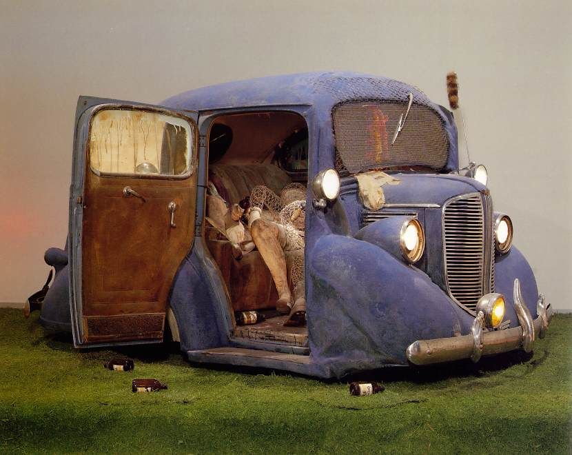
Back Seat Dodge
Edward Kienholz, Back Seat Dodge '38, 1964, polyester resin, paint, fiberglass, and flock, truncated 1938 Dodge, clothing, chicken wire, beer bottles, artificial grass, and plaster cast, 66 x 240 x 144 in (via an awesome Russian Ed Kienholz website)

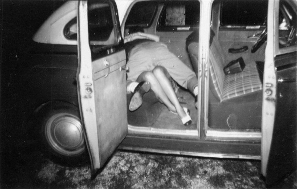
untitled
Bobby Smith, untitled (Tampa, FL), 1950s, from the The Rex Maniscalco Collection of Bobby Smith Photographs and Other Materials at the University of South Florida Libraries (via I've Had Dreams Like That)


Share


Thursday, June 21, 2012

A Note on Brass Tacks at GGallery

by Robert Boyd

Brass Tacks, a group exhibit at GGallery, started by asking three San Antonio artists to invite other artists. So the first three artists essentially curate the rest of the show. The thing is, I'm not sure who the first three artists are. In any case, its a novel curatorial tactic, and the results are generally pretty appealing. Here are some of the pieces I liked.

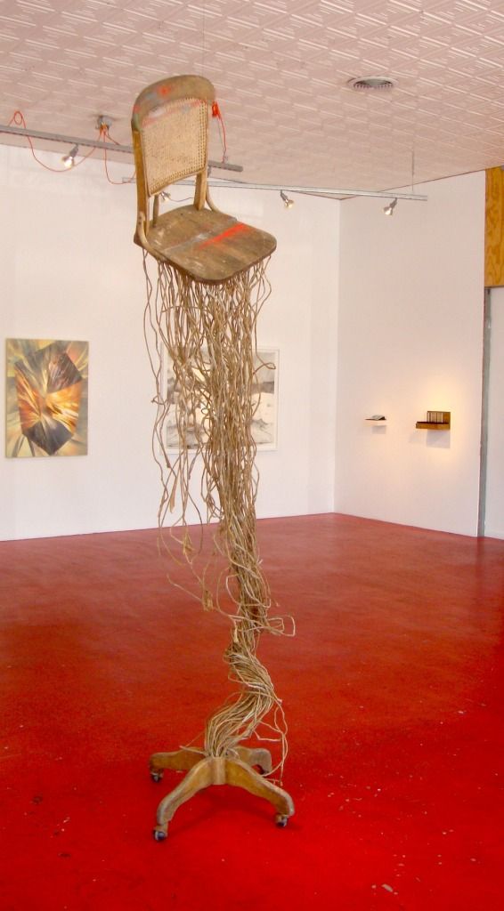
The first piece you see when you enter the gallery is Ronny Unraveling by Clay McClure. McClure starts with antique and used wooden furniture and transforms it.

Ronny Unravelling
Clay McClure, Ronny Unraveling, 2011, wood chair, paper rope

This piece struck me as a sculpture of a moment frozen in time--a fantastic moment during which a chair has become possessed by some plant spirit and explosively sprouted roots. When you see Ronny Unraveling, you can see in your minds eye the moments just before--when the chair was an ordinary chair and when it started growing. The piece has an Alice in Wonderland strangeness, accentuated by the fact that the seat, back and bottom of the structure are clearly parts of a very real and very ordinary chair.

Mouth
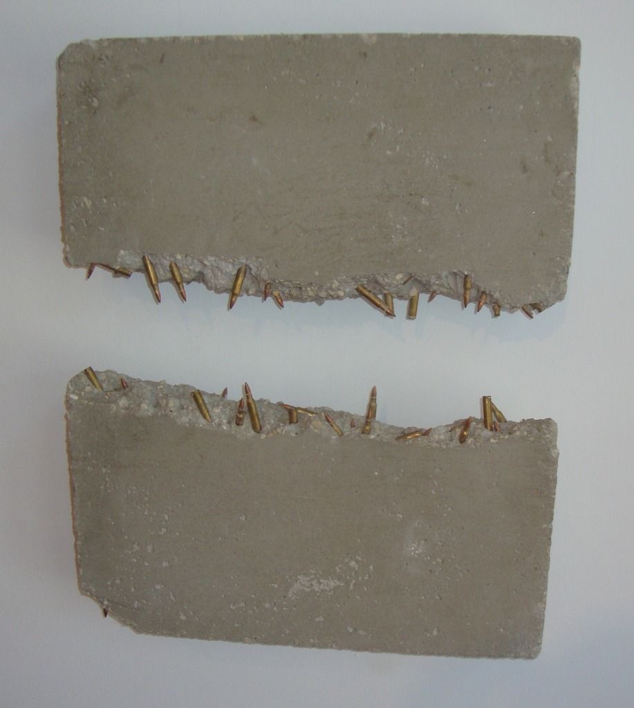
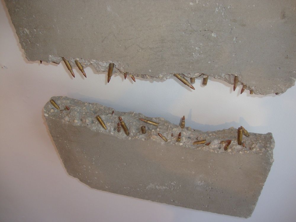
Joseph A. Duarte, Mouth, 2011, inert bullets, concrete

Joseph A. Duarte uses bullets in his two pieces. Inert bullets are bullets without gunpowder or any propellant. Mouth is a sculptural depiction of a mouth, with ragged concrete gums and snaggly bullet teeth. Mouth is both ridiculous and menacing, and the use of bullets reinforces this.

Mouth
Joseph A. Duarte, Mouth, 2011, inert bullets, concrete

Mouth is not quite toothless, but it doesn't seem particularly threatening. The inert bullets are impotent.

War Is a Lot of Things
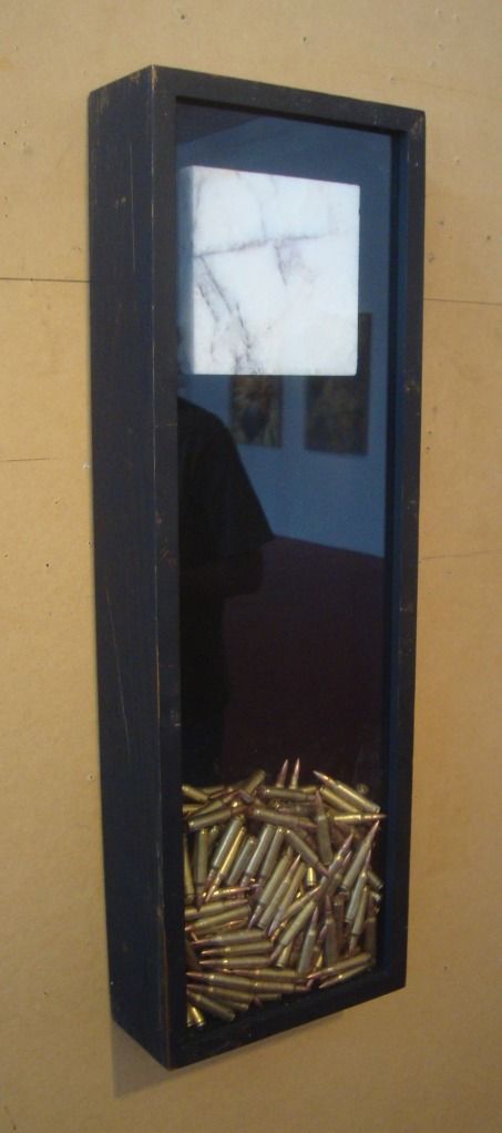
Joseph A. Duarte, War Is a Lot of Things, 2011, inert bullets, marble

War Is a Lot of Things is more elegant than Mouth. The lovely piece of marble suspended over the bullets is prettier than the ragged concrete of Mouth. Even the bullets look better--stacked together in a glass enclosure, they show the viewer their noble brass jackets. Mouth is the old soldier as he is; War Is a Lot of Things is that soldier in his pressed uniform wearing his medals for Veterans Day.

I keep them as a reminder
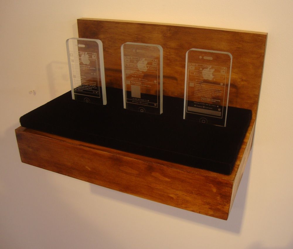
Tommy Gregory, I thank God for teaching me humility, 2012, optic crystal

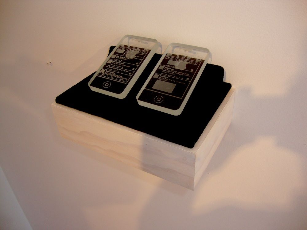
And speaking of elegant, I loved Tommy Gregory's crystal iPhones. They are appropriate monuments to this wonderful piece of technology--and they will last far longer than iPhones which, after all, will surely be obsolete in a few years. I realize that they could be read as ironic--that they could be seen to make a critical comment on our powerful attachment to our gadgets. But given that it could be read either way, I choose to read it as a straightforward homage to the iPhone.

I thank God for teaching
Tommy Gregory, I keep them as a reminder they're not killing me, 2012, optic crystal

Almost as important as the objects themselves are the displays. They communicate a sense that these are important, precious objects.

Time will take care of itself
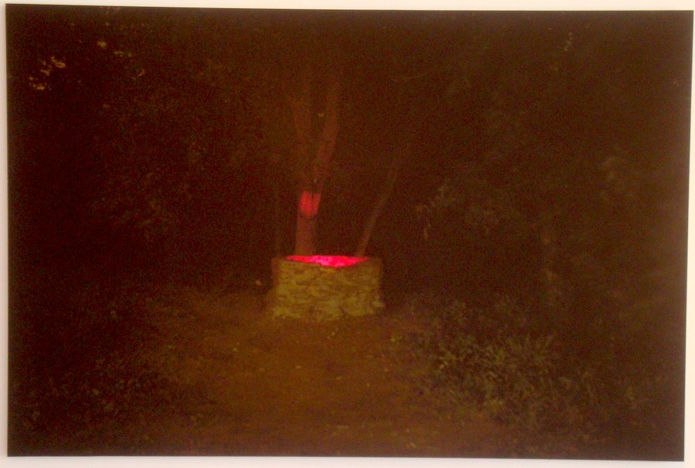
Justin Parr, Time will take care of itself, just leave time alone, 2011, archival pigment print

Justin Parr contributed this spooky image, Time will take care of itself, just leave time alone. The stone well at night with a red glow from inside--it feels like something out of Twin Peaks. You don't want to look into that well, but you are compelled to.

Mezclar
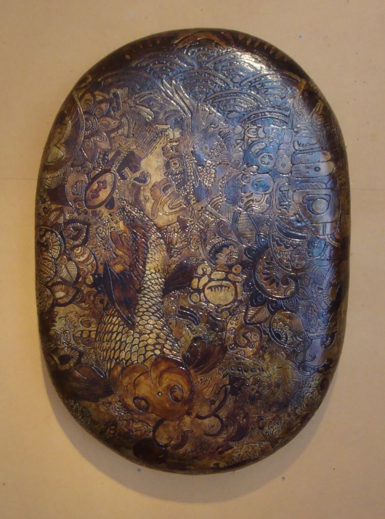
Willie Sanchez, Mezclar, 2012, plaster, tar, polyurethane

Mezclar is the Spanish verb "to mix", and Willie Sanchez's Mezclar appears to mix Mesoamerican graphic elements with Japanese elements. The oval-shaped surface recalls a turtle shell, and the dark blotchy stain has a highly organic look. Mexclar feels more like an archeological artifact than a piece of contemporary art. An artifact from a non-existent culture, a mixture of other cultures. One could probably concoct a convincing historical explanation for this piece. The culture that created it valued beauty--that much seems certain.

Brass Tacks is up through June 29.


Share

Tuesday, April 10, 2012

Your Mom, Your Stuff, Your Friends and Their Stuff at Box 13

by Robert Boyd

Box 13 is doing its part for FotoFest with four lens-based shows. The one that hit me the hardest was Identified and Objectified: A Study of the Ephemeral, featuring work by Shannon Duncan, Brittney Connelly and Bryan Forrester. Of these three artist, the one whose work I found least interesting was Brittney Connelly. Her video of her stuff being tossed onto her prone body struck me as an obvious metaphor (our stuff, our accumulative natures, weighing us down). I see this as relating to a certain romantic notion that if we could just free ourselves of material concerns, we'd be free! Perhaps I'm misinterpreting her work, but what I saw didn't impress me.

Shannon Duncan's friends
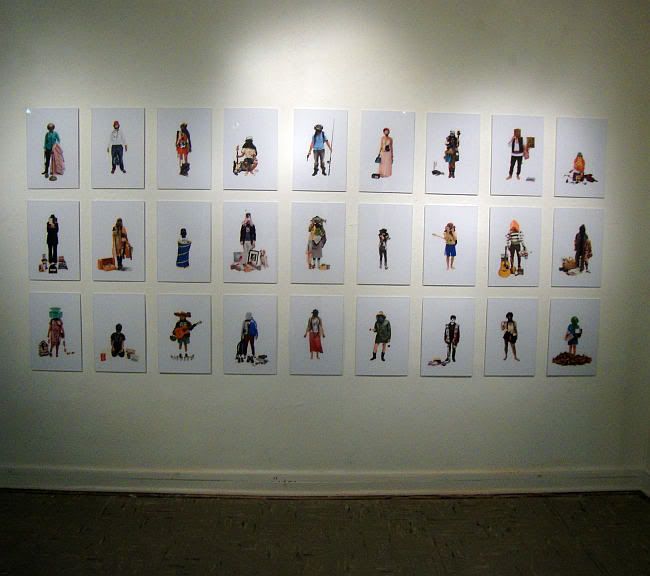
Shannon Duncan, Eu-phemera photo installation, 2011-2012

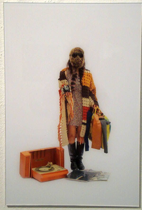
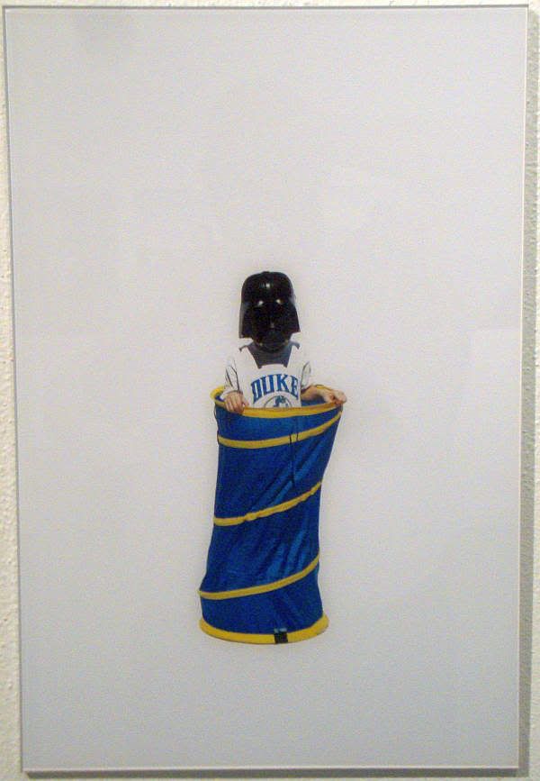
Shannon Duncan's take on a similar subject, Eu-phemera, was far better. She had friends pose with things (including clothes) that were meaningful to them. They are posed against a blank white background. Their faces are always covered. I interpret this as Duncan taking identity away from the face--the way we recognize people and consequently the primary source of their visual identity--and placing identity in the stuff itself.

Shannon Duncan's friends
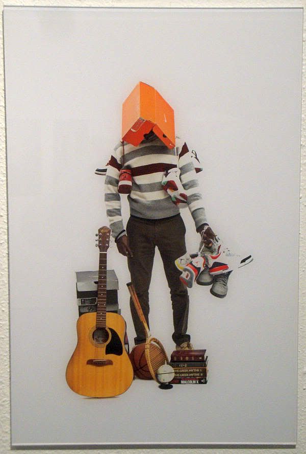
Shannon Duncan, Eu-phemera photo installation detail, 2011-2012

This guy, for example, tells us with his stuff that he's an athlete, a musician, a reader of mythology and African-American history.

Shannon Duncan's friends
Shannon Duncan, Eu-phemera photo installation detail, 2011-2012

With her miniskirt and boots, she seems like she stepped out of the 60s, a perception that is reinforced with the cheap portable record player and knit rug. On the other hand, the Pink Floyd record and predominance of orange and brown say "70s." But oddest is the raccoon skin on her face. On of the pleasures of these photos is that they invite you to try to "figure out" the subject. Does all this stuff actually add up to one real person, after all?

Shannon Duncan's friends
Shannon Duncan, Eu-phemera photo installation detail, 2011-2012

But sometimes the interpretation of the stuff is delightfully easy. This boy in his Darth Vader mask may serve to remind us how early our life-long relationship with stuff begins, but it's also funny and delightful. I thought this group of photos communicated pleasure--these things that people were posed with were important because they loved them. Their pleasure comes through. It's infectious.

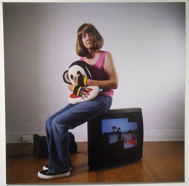
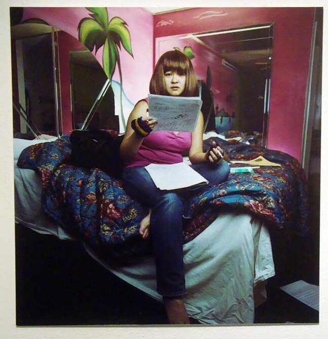
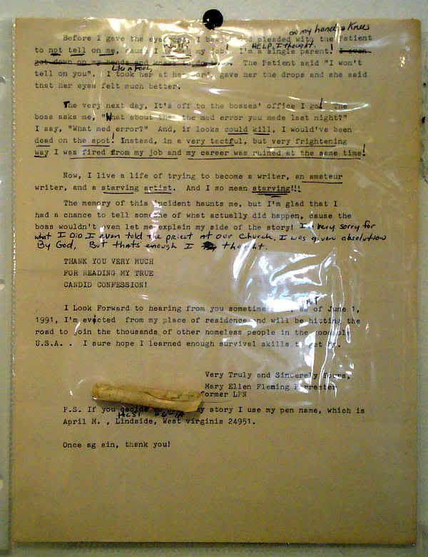
It's nice that Shannon Duncan was able to make me smile, because Bryan Forrester's installation, Every Woman Is My Mother, was not such a happy story. The piece consists of photos and paper ephemera. I noticed the photos first, which I think was Forrester's intent. They were photos of different women (different ages, races, and body types) all dressed alike.

Every Woman Is My Mother
Bryan Forrester, from Every Woman Is My Mother

Every Woman Is My Mother
Bryan Forrester, from Every Woman Is My Mother

I am assuming that the wig and outfit come from some memory or photograph of Forrester's mother. By themselves, they are an unsettling series of images--the emotional content of the photos seems progressively more powerful and fraught. Then when we get to the back wall, where the ephemera is pinned up, the viewer gets a second punch in the gut.

Every Woman Is My Mother
Bryan Forrester, from Every Woman Is My Mother

Every Woman Is My Mother
Bryan Forrester, from Every Woman Is My Mother

(The images above have been color-corrected to make them more readable.)

Forrester's mother, a nurse, had a mental illness that caused him to become estranged from her. I assume her early death is related to this illness. This installation, which includes both his imaginings of Mary Ellen along with Mary Ellen's own notes and writing appears to be an attempt to reconnect with her posthumously. The pink tank top and jeans must be for Forrester important memory objects--perhaps this exhibit is an attempt to connect the woman in these disjointed, disturbing writings with his own memories. Possibly the jeans and tank top represent a good memory for Forrester that he is trying to latch onto. But as viewers, we can't be sure.

Every Woman Is My Mother is powerful. It made me angry at Forrester for allowing himself to become estranged from his mother, a person who obviously needed help and looking after. I realize this is unfair--but it's a response made possible by the photos and objects that Forrester puts out for us to see. The work exudes guilt and sadness. We see that Mary Ellen, whatever her problems, had goals and a desire to express herself. She is someone we can feel sympathy for--Forrester wants us to feel sympathy. The choice of documents seems to have been made in part with this goal.

A lot of art I see is dry, clever, intellectual, beautiful to look at--and I value all those things. But it's rare these days to see art that has this kind of emotional power. I still don't know what I think--feel--about it. Sadness, anger, pity. Head out to the East End and spend some time with this exceptional work.


Share