Barbara Kruger, Untitled (I shop therefore I am), 1987, Photographic silkscreen on vinyl 111 5/8 x 113 1/4 x 2 1/2 inches
The artists included in Urban Theater: New York Art in the 1980s were major figures during the decade itself. Moreover, with a few exceptions, selections are arranged in the galleries according to then-predominant critical categories. For example, works by Cindy Sherman, Richard Prince, and Robert Longo are in one room, exemplifying the “Pictures Generation” strategy of appropriating popular culture images. In this sense, the exhibition, at the Modern Art Museum of Fort Worth and organized by the Modern’s Chief Curator Michael Auping, eschews revisionism.

Robert Longo, Untitled, 1981, Charcoal and graphite on paper, 96 x 60 inches
Relegated to the rear gallery are the most explicit politics. Numerous posters by the Guerrilla Girls critique the under-representation of women in the institutional artworld. Extra-artworld politics are exemplified by vitrine displays of material artifacts from ACT UP, the AIDS Coalition to Unleash Power. Mass movements around AIDS and feminism, and around queer communities and government censorship as well, were only one emphasis of the era’s art. Nonetheless, that art as a whole, and the sometimes vitriolic arguments around it, is better understood by way of the larger, political context.
Among the decade’s theoretical disputes, Benjamin Buchloh, Craig Owens, Douglas Crimp, and others challenged either painting’s contemporary tendencies – e.g. neo-expressionism – or the medium tout court. An ideology critique of art’s role in burgeoning political reaction, especially in western Europe, was fundamental in those debates; however hazily, the question of art’s positive valence for future progressive political upsurges was, as well. (That some of those claims no longer apply, given shifting historical conditions, is obvious.) Oil-on-canvas was regarded skeptically.

Julian Schnabel, The Jute Grower, 1980, Oil, plates, and Bondo on wood, 90 x 120 inches
In Julian Schnabel’s huge “plate” painting The Jute Grower (1980), crockery projects boldly from the picture plane, and the board’s diagonal sides, into the exhibition space. Some pieces are almost whole; some semi-circular, remaining identifiably part of a shattered dinner plate, saucer, teacup, or bowl; and some random shards. Most visual characteristics other than shape, such as decorative patterns, are obliterated by naturalistic midnight-blue slathered on each piece. The boards are only partially filled with dinnerware; there are “empty” areas of craggy white, metaphorizing earth or vegetation. The surface barely holds the roughly modeled image of a man and (presumably) jute stalks, readable from only a medium distance or further back. This painting is more object-like – and less the flat picture screen so crucial for artists elsewhere in the show.
Surfaces through which images have to “fight” are even more variegated in other Schnabels. Dinnerware can saturate an entire board, intensifying the abex, all-over effect. Ornamented crockery – unbroken and unpainted – can demand to be read as such. Palettes can be diverse and multichromatic. Even real tree branches or antlers can be included. The broader works’ heterogeneous materiality is attenuated in The Jute Grower.
This base materiality is surely related to earlier, lauded 1970s post-minimalism, with which neo-expressionism supposedly ruptured. Nonetheless, longstanding critical neglect of Schnabel’s painting is only now being overcome.

David Salle, Clean Glasses, 1985, Acrylic and oil on two canvas panels, 105 x 100 inches
In a work, David Salle frequently juxtaposed highly divergent styles: photographic reproductions; industrially produced, decorative fabrics and other found objects; hard-edged geometric abstraction; and imagistic representations. Clean Glasses (1985) attenuates that divergence, with its consistently imagistic idiom and thin, sketchy application of paint.
Classic dichotomies in painting are visually articulated. The top panel’s recessive, artificial reds versus the bottom panel’s more-dominant earthtones refer to modernist contention around surface and depth. The former’s cool, photographic source versus the latter’s expressionistic handling gestures toward further modernist debates around artistic creativity’s source.
These formal dichotomies are, problematically, recoded in terms of a traditional masculine / feminine duality. This arises from pornographic conventions such as the headless woman, rendered in soft-focus, red grisaille (Salle had worked for Stag magazine). Shadows cast between the woman’s legs, spread and centered before the viewer, indicate a sexualization of spatial concepts of “depth”, as figuratively a woman’s body to be penetrated. “Depth” is further gendered as a domestic interior – paradigmatically feminized in patriarchal society – vis-à-vis the residential building’s exterior and laundry hanging from the balcony. The impression of “domesticity” is strictly derived from these latter sign-relations, as the cloud of red in the top panel does not actually resolve into a room or rear wall.
The active subject to which all of this is counterposed is implied by the wall’s agitated brushstrokes, moving in all directions, and the perfunctory modeling, particularly of the left window and exposed bricks at right. In arguments around abstract expressionism, such subjects had been paradigmatically masculinized.
Hal Foster wrote of a concurrent work: Salle’s “Brother Animal (1983) is … a formulaic display of dead, dispersed images with charge enough only to damp out any connection or criticality”; “[t]his is fragmentation at its most entropic, most cool” (Recodings 1985, 134). This was a not-uncommon response to the artist’s “postmodern” stylistic diversity – and its rupture with a self-critical, self-referential trajectory a la Clement Greenberg. Conversely, feminist Mira Schor blasted Salle, dismissing notions that such heterogeneity evacuated meaning itself. That meaning was identified as precisely the works’ noxious, anti-woman approach and its inextricable entanglement with his critical perspective on painting’s history.
Graffiti artists in the show include Coleen Fitzgibbon and Robin Winters, both part of the important 1980 Times Square Show, as well as Jean-Michael Basquiat, Kenny Scharf, and Keith Haring. The latter was an effective communicator and wanted mass audiences for his images. Haring’s ubiquitous work appeared in mass media outlets like MTV and was sold at his Pop Shop retail stores. This populist vibe and commercial stench led to – once again – critical neglect in the US.

Keith Haring, Untitled, 1982, Sumi ink on paper, 107 x 160 inches
Haring created widely distributed designs for political movements: against the white-supremacist apartheid regime in South Africa; around the AIDS crisis; and against nuclear weapons. Outside those hopeful movement contexts, his large-scale drawings in Urban Theater have ominous undertones. Untitled (1982) depicts a seven-headed hydra before which multiple figures are fleeing. A central figure holds another aloft; as indicated by short lines emanating from the prostate body, and similar to Haring’s famed Radiant Baby, the latter is “glowing”. (Is this a sacrifice, or a rescue?) The hydra heads spew fire or smoke – suggested by wispy lines analogous to vertical, abex-styled ink-drips elsewhere on the paper, and unlike the artist’s usual thicker, homogeneous line. The creature’s outline is full of Xs or crosses, signaling its surface and hinting at the Christian fundamentalist base of the Republican Reagan administration – which, not coincidentally, supported the apartheid regime, aggressively deployed nuclear missiles throughout western Europe, and turned AIDS into a global crisis through its criminal neglect.

Peter Halley, Glowing and Burnt-Out Cells with Conduit, 1982, Acrylic, Day-Glo acrylic, and Roll-a-Tex on canvas, 64 x 96 inches
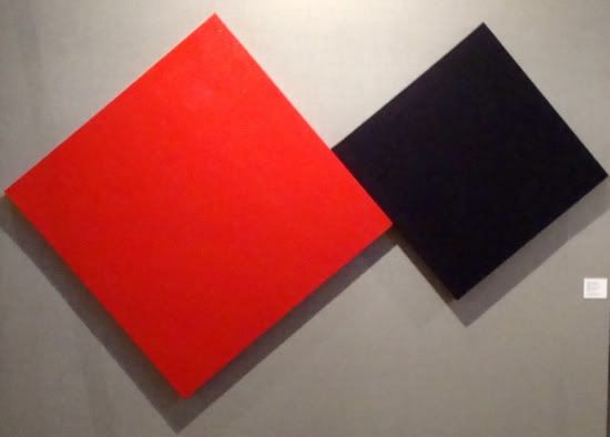
Well-known essays by critically valorized Peter Halley stressed how geometric abstraction – specifically the grid – reflected the rigid, repeatable, serial order of modern life: from suburban developments to office cubicle to shopping malls. That is materialized in his Glowing and Burnt-Out Cells with Conduit (1982), with its square, red and black “cells” of roughly textured Roll-a-Tex, similar to standardized treatments for walls and ceilings in cookie-cutter housing. This, again, departed from postwar, western modernist perspectives in which medium specificity, opticality, or geometry’s “transcendental” nature was key. Such perspectives rejected using geometry as linguistic signs, whether critical or not of everyday life and its alienations. Abstraction-as-sign is, of course, integral to appropriation-based postmodernism elsewhere at the Modern.

Philip Taaffe, Brest, 1985, Linoprint collage on paper mounted on canvas, 78 1/4 x 78 1/2 inches
The artworld umbrella of “simulationism” encompassed Halley, Philip Taaffe, and Ross Bleckner. The latter’s Sanctuary (1989) addressed the then-raging AIDS crisis, which was killing tens of thousands every year in the US, with no end in sight. As if the imagined walls and ceiling had been perforated, a darkened interior is punctuated with hundreds of shimmering “lights” – that are, indeed, negative space on the canvas, exposed areas of golden-bronze underpainting. As with Halley, conventions of geometric abstraction and the grid are connoted. The “lights” are positioned in rows at regular intervals; rows are almost horizontal, as in minimalism, towards the bottom; and higher, rows’ upwards curvature increases with mathematical uniformity. Contours of what appears to be a domed vault, its top centered, are traced; the brightness increases, by way of strengthening hues in the underpainting, towards the dome’s center. As with Halley, all of this points outwards to the social, each equivalent light signifying a loss from mass death.

Ross Bleckner, Sanctuary, 1989, Oil on canvas, 84 x 60 inches
The painterly medium of Sanctuary was “conservative”; its status as a unique object, proper for galleries or museums; and its tone reflective rather than militant. This was quite unlike the politicized practice of other artists who engaged with AIDS activism and, out of urgency and necessity, prioritized photography, prints, and similar mass-reproducible media. New anti-retroviral therapies for HIV began dramatically reducing mortality rates in the late 1990s, and Bleckner’s poetic work of mourning seems more apropos today.

Barbara Kruger, Untitled (Your body is a battleground), 1989
Distant from painting, Barbara Kruger’s vibrant polemics were routinely adopted by progressive publishers and journals; public awareness campaigns around issues like domestic violence against women; and political events. Untitled (Your body is a battleground) was used on posters for the 1989 March for Women’s Lives, focused on abortion rights, in Washington, DC.
However, Kruger is solely represented in Fort Worth by Untitled (I shop therefore I am) (1987). Proportions suggest near-square aspect ratios of analog, tube televisions, although the sheer size suggests an advertising board. The hand presents a business card shape on which the text is printed, reinforcing that it’s all about commerce. This riff on Descartes is a (now) banal ideology critique of the construction of identity through consumerism and commodification, a critique imagining passive, mass audiences apt to wander a shopping mall. Kruger’s genuinely political graphics closely target audiences more conscious and engaged, on the ground, precisely by identities and their material foundations.
In limited selections from Cindy Sherman’s Untitled Film Series featured at the Modern, she performs women’s roles associated with Hollywood movies of the 1950s and early 1960s – such as the femme fatale and damsel-in-distress. Denotative elements include period design, such as hats, hairstyles, and early-modern skyscrapers.

Cindy Sherman, Untitled Film Still #55, 1980, Gelatin silver print, 30 x 40 inches
Readings of Sherman over the years have proposed that the series takes a critical perspective on performativity: of femininity; of other gender positions, such as masculinity (a widely unacknowledged presence within some of these works); or of gender itself. This occurs via the multiple roles’ random, non-narrative appearance throughout the series; and via the photographs’ ostentatious theatricality – as in the artists’ brightly lit face, set against a dark backdrop, in Untitled Film Still #55 (1980). As well, the black-and-white photographs evoke an era before color cinema; and the calculated treatment of Untitled Film Still #5 (1977) creates an effect of grainy, low-resolution film stock. The material medium’s latter two properties can formally connote the 1950s and thus – when Sherman made these works – the roles’ sense of historical artifact and changeability.

Cindy Sherman, Untitled Film Still #5, 1977, Gelatin silver print, 30 x 40 inches
Feminist movements, a product of the 1960s’ upheavals, were in the 1980s still expanding their influence in broader culture, gaining political and legal victories, and maintaining optimism about the future. Reactionary politics around women and gender could be understood as substantively in the past, the 1950s. That is no longer the case, of course, with a roaring right-wing offensive underway against abortion rights, contraception, and women’s gains generally.
Gender is thus posited as de-essentialized, a social construct. These readings were influenced by disputes within radical feminism, in which “woman” was allegedly determined by natural, biological characteristics: for example, the ability to birth children. The current, relative weakness of the women’s, and other social, movements – and the relentless commodification and consumerism addressed in Kruger’s Untitled (I shop therefore I am) – means these readings and Sherman’s canonical series now lack that critical energy. The multiplicity of social roles no longer signal “performativity” or “gender” as such, but rather the individual, empirical positions themselves – more straightforwardly assimilable to the shopping mall.
The decade’s art, particularly painting, could be exuberant. This is a minimal aspect of the exhibition, though, Scharf’s work aside. The weight, across different media, is unmistakably on the linguistic and conceptual, enabling visitors to better grasp the burning questions of that time.
“Urban Theater: New York Art in the 1980s” is on view at the Modern Art Museum of Fort Worth until January 4, 2015.


