Showing posts with label Jackson Pollock. Show all posts

Sunday, December 8, 2013

Philip Guston and Jackson Pollock Were Expelled From High School

Robert Boyd

[Philip] Guston and [Jackson] Pollock were also politically active in their support of art education at a school that was fast becoming a hotbed of talented high school athletes. Their activity reached a climax when they were expelled for publishing and distributing leaflets against the popularity of high school sports. (Michael Auping, introduction to the catalog for Philip Guston Retrospective, 2003)

To which I can only say RIGHT ON!


Philip Guston, Drawing for Conspirators, 1930, graphite, ink, colored pencils, and crayon on paper, 21 1/2 z 14 1/2 inches. This was drawn when Guston was 17.

Wednesday, February 22, 2012

John Chakeres at John Cleary Gallery

by Robert Boyd

Car Park, Columbus
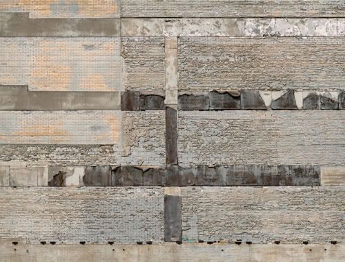
John Chakeres, Grey Wall, Columbus, archival pigment ink print, edition of 10, 2011, 31.5 x 41.5 inches

The first thing you notice when you see these large photographic prints by John Chakeres at John Cleary Gallery is that the subject matter is flat. It's a flat image of a flat subject. This is not to say that the subjects have no texture. Grey Wall, Columbus, for example,  has peeling tar paper and rough concrete textures. But Chakeres is making photos of walls--things with no volume.

This puts one in mind of the modernist ideal as promoted by Clement Greenberg and Michael Fried. These writers developed a highly essentialist theory of painting, noting that one common feature of painting was that it was on a flat surface, and that therefore the subject should be flat. Any sort of suggestion of volume was forbidden. This was one reason Greenberg liked Jackson Pollock so much. His all-over compositions didn't create any sort of illusion of space--every square inch of the canvas seemed to be equally on the surface.

Painted Windows, Columbus
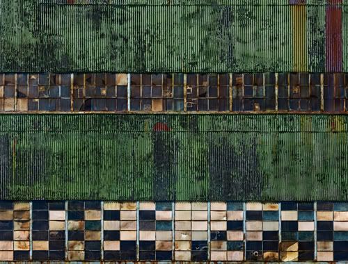
John Chakeres, Painted Windows, Columbus, archival pigment ink print, edition of 10, 31.5 x 41.5 inches, 2008

While Greenberg and Fried seem like puritan spoilsports in hindsight, Pollock still has the power to influence artists today. Chakeres wanted to create photos that operated in some ways like a Pollock. Chakeres noticed that a Pollock operated equally well from across the room as from an inch away. He wanted to create large color photos that worked that way--as overall compositions and as detail. These tiny JPEGS can't even hint at the degree of detail visible in these photos. Each brick and window pane in Painted Windows, Columbus is its own highly detailed, textured  image of a brick or window.


Factory Wall, Columbus
John Chakeres, Factory Wall, Columbus, archival pigment ink print, edition of 10, 31.5 x 41.5 inches, 2010

To achieve this, Chakeres took dozens of photos of each wall and used software to stitch the images together into a single whole. The result is a photo that few film cameras (maybe those room-size Polaroid cameras) could take. The result were files larger than one gigabyte (although after the layers were flattened, the final image files were slightly under a gig). In a way, it took until now for photos to be able to technically match what Pollock was doing the 40s and 50s.


Screen Wall, Columbus
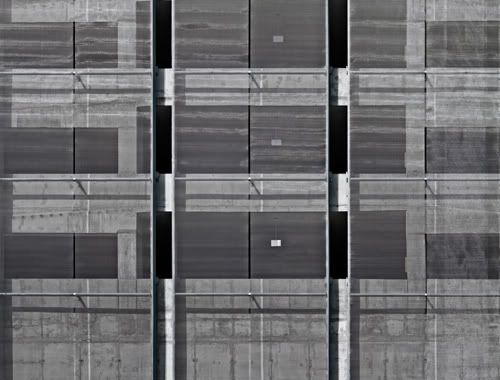
John Chakeres, Screen Wall, Columbus, archival pigment ink print, edition of 10, 31.5 x 41.5 inches, 2010

But let's face it. Chakeres is no Pollock. Screen Wall, Columbus looks more like an Agnes Martin. And Pollock wasn't just creating flatness--he was expressing himself. Each twisting tangle of paint is Pollock's handwriting. The paintings have vigor, sometimes languid, sometimes nervous, but always in motion. There is no motion in Chakeres's photos. His approach is deadpan. And that's the irony. These matter-of-fact walls--walls that one would consider ugly in person, if one even noticed them at all--are made beautiful by Chakeres's careful editing. They are beautiful, deadpan images, and when you think about it, making those two ideas work together is an admirable feat.


Share

Sunday, October 30, 2011

Ibsen Espada's Expressionism

by Robert Boyd

What does it mean to be an abstract expressionist forty or fifty years after the movement ran out of steam? That's what I asked myself looking at Ibsen Espada's new show at New Gallery/Thom Andriola. Espada was one of the artists chosen for Fresh Paint, the ground-breaking painting show at the MFAH in 1985. He had several years of real success after that. But by 2004, he was almost completely out of the art world--and the subject of an article in the Houston Press about how hard it was to be a Hispanic artist in Houston. As far as I could determine, his last exhibit was in 2002.


Ibsen Espada, Winter Dragon, mixed meda on canvas, 2011

Looking at his new exhibit at New Gallery/Thom Andriola, I'd say Espada has come roaring back. This work has real power and vigor. To me, it reminds me of pre-drip Jackson Pollock. The restricted color scheme of Winter Dragon, combined with the thick brushstrokes and swirly all-over composition, really make this work for me. This is my favorite piece from the show.


Ibsen Espada, Victory, mixed meda on canvas, 2011

One thing Espada does that few abstract expressionists did is collage his own canvases. He did it in Winter Dragon, and the effect was subtle. It is much less subtle in Victory. With Victory, it appear that he cut up three or four separate, very distinct canvases to create this collage. It may be the collage element that separates him from his artistic ancestors. Collage strikes me as intellectual and not instinctive. It is less perfomative than abstract expressionism.It has a deliberate quality that balances out the slashing energy of the painted parts.


Ibsen Espada, Sparticus, mixed meda on canvas, 2011

 Ultimately, Espada's master is Pollock. Espada's handling of paint is similar to that in Pollock's Mural. Espada's collaging of his canvases, particularly in Sparticus, creates a kind of boxed-off composition similar to Pollock's The Guardians of the Secret. The thick swirling blacks of Winter Dragon recall Pollock's Number 11. What's interesting to me is that Espada hasn't gone all in and tried to use drip technique.


Ibsen Espada, El Mirador, mixed meda on canvas, 2011

A lot of people would say, what more does this dated style, abstract expressionism, have to say to us? What relevance does the hero artist, contending with the void, slashing away with color, have today? There are all kinds of reasons not to do abstract expressionist paintings in 2011. But for Ibsen Espada, there is one good reason to keep doing them. They work.


Share

Friday, November 5, 2010

Houston Abstractionists Outside the Loop

It's convenient that almost all the visual art on public display is inside the Loop, indeed in six specific inner loop neighborhoods--the Museum District, Montrose, the West End, the Heights, Downtown and (increasingly) the East End (with a few outposts in the 3rd Ward and the 5th Ward). Convenient for people like me who go to see multiple art shows every weekend. But it's also unfortunate that the vast majority of the Houston area, that part outside the Loop, is pretty much an art-free zone. So it was surprising and kind of exciting that The New Black, Contemporary Concepts in Color and Abstraction was opening in the lobby of Williams Tower (formerly Transco Tower), the tallest building in the Galleria area. He was a show of four abstract painters doing uncompromising work. And it was not in the "safe" environs of one of the Colquitt galleries or Lawndale or Box 13. I'm always intrigued by art like this:
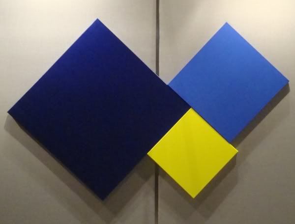
Myke Venable
Myke Venable, Venetian Blue/Cobalt Blue/Fluorescent Yellow, acrylic on canvas, 2010

In an environment like this:
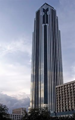
Philip Johnson
Philip Johnson and John Burgee, Williams Tower, 1983

Its many tenants include energy companies, insurance companies, real estate developers (including Hines, which developed this building and many of the most architecturally memorable buildings in Houston), law firms, financial service firms, HR firms, and banks. At least half of them come in through this lobby every morning. So this show was seen by a lot of white collar workers who probably have no idea what to make of it. And they may, therefore, be hostile to it.

I spoke about this to Myke Venable at the opening. He told how it had been difficult to explain to his family what he was doing, and he mentioned it to an art professor who reminded Myke that he had been studying art for several years, and that his family had never studied art. It's simply a fact to appreciate modern art or contemporary art is something that requires long exposure or education. That said, because of influential modernist designers like Paul Rand, we see geometric abstractions in the form of maps and info-graphics every day. For example, in the lobby of Williams Tower--right in amongst the art--were a pair of signs like this.

Williams Tower Sign

I wonder if any of the office workers made a connection.

Anyway, the show is really good. It was an unusual collection of artists--three geometric abstractionists and one more gestural, painterly abstractionist, Veneman. They could also perhaps be divided into artists who were influenced by natural forms (Guidry and maybe Veneman) and one whose work recalled architecture (Leach) and one whose work was so completely abstract that it seemed divorced from the world of things we see.

Michael Guidry seems to be working from actual landscapes, which he abstracts to the simplest possible groupings of colors.
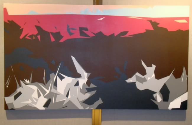
Michael Guidry
Michael Guidry, Your Messed Up Life Still Thrills Me, latex on canvas over wood panel, 2010

Please excuse my bad photographic skills--this is the only Guidry I shot that was in focus. And unfortunately, it is the least recognizable as a landscape (except for its basically horizontal composition). The way he deals with landscape reminds me of early, primitive three-dimensional renderings of landscapes on computer. By simplifying the forms down to a minimum of colors and complex polygon shapes, computers could process the data it took to depict a viewpoint moving through space in a landscape. Because this was just a moment in the history of computer graphics, it gives Guidry's landscapes a curiously nostalgic look. It's as if he is saying that when computer artists learned to create super-realistic depictions of places, as in Avatar, they lost something. I think so, too.

Jonathan Leach takes a more architectural approach to his straight-edge paintings. I reviewed his show at Sonya Roesch last year, and some of those pieces are also shown here. But there are a lot of newer pieces as well. Leach's work is characterize by bright, fluorescent colors (hard to photograph adequately, alas) and extremely hard-edges. The paint is applied with a minimum of gesture, but is not perfectly flat. You can still see the parallel lines caused by the brush, or the dots of raised canvas. The exception to this is when Leach paints on the opposite side of clear plexiglass (a technique that Jim Nutt also used in his early paintings), which gives a supersmooth, somewhat inhuman look to the work. He plays with this effect in Move Me, where he paints on both the back and the front of a sheet of plexiglass.
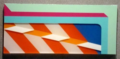
Jonathan Leach
Jonathan Leach, Move Me, acrylic on plexiglass, 2010

The stripes painted on the side facing the viewer, as precise as they are, still show--barely--the hand of the maker. The ones painted on the side facing away have that inhumanly smooth quality. And because the plexi has thickness, the outside layer of paint floats above (and casts a shadow on) the inside layer.
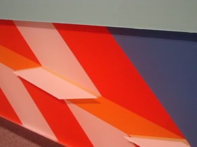
Jonathan Leach
Jonathan Leach, Move Me detail, acrylic on plexiglass, 2010

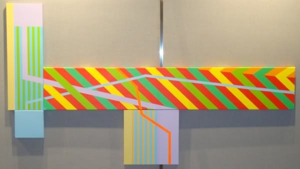
Leach also plays with multiple canvases put together, as in As Predictions Suggest.
Jonathan Leach
Jonathan Leach, As Predictions Suggest, acrylic on canvas, 2010

Works like this inevitably remind me of Peter Halley. Like Halley, Leach is building a composition out of specific formal elements. The work therefore recalls earlier geometric abstractionists and even minimalists. But it also seems to deliberately recall things or signs (literally) that we encounter in the world around us. As Predictions Suggest has elements of warning signs (the diagonal stripes), maps, and infographics. Even the fluorescent colors are highly suggestive of warning signage. This piece seems to be saying, danger ahead.

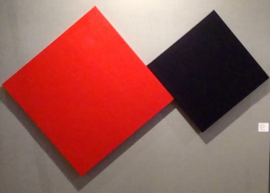
I would never have a reaction like that to a piece by Myke Venable. By using diamond-shaped canvases, he does recall the shape of certain traffic signs, but I don't think this is intentional. I think Venable's intentions are purely formal. At least, that's the reaction I have to his work when I see it.
Myke Venebale
Myke Venable, Cadmium Red/Violet, water-based enamel and acrylic on canvas, 2009

There are two ways to look at this art. One is to think in metaphysical terms, staring at the colors and thinking about the nature of color and the effect of one color next to another. And perhaps contemplate the cosmos as the same time. In short, view the paintings in a way similar to how Kazimir Malevich and Yves Klein. I respect that, but it's not a road I can follow as a viewer. The other way to approach these works is to think of them as a challenge the artist set for himself. Give yourself constraints--extremely limiting constraints--and try within these constraints to create a work that looks beautiful, that looks right. When I heard Robert Irwin speak at Rice about his early minimal paintings, this was how he did it. My old teacher, Stella Sullivan, worked this way on her symmetric geometric abstractions (which can be seen right now at William Reaves Fine Art).

However Venable creates the work, the result is appealing. (That's why I bought his piece at the Lawndale retablo show.)

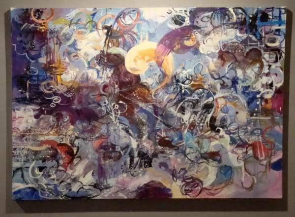
Leach, Guidry, and Venable each work with flat colors, minimizing the visible hand of the artist. In that regard, Katherine Veneman is the odd artist out. Her work is gestural and painterly, and mark-making is clearly something important to her. Her work comes more directly out of the American abstract tradition.
Katherine Veneman
Katherine Veneman, Pause, oil and oilstick on canvas, 2007

Even her use of an oilstick to draw lines on the canvas recalls pre-drip Jackson Pollock. But her work otherwise doesn't resemble his at all. The swirling curliques here, the complex overlapping calligraphic arabesques, actually made me think of the work of Lari Pittman when I first looked at this piece. Veneman's work is far more spontaneous and gestural, but the density and curvilinear marks are similar.
Katherine Veneman
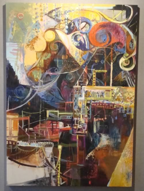
Katherine Veneman, Charting the Territory, oil, oilstick on canvas, 2002

Charting the Territory, on the other hand, made me think of Roberto Matta. And maybe that is the origin of her work--those late abstract surrealist works by people outside the main surrealist circle, people like Matta, Lam, and the American artists who later became abstract expressionists. This is a stream of abstraction that is always in danger of veering into kitsch--but I think Veneman avoids this pitfall with her beautiful canvases.

One final image for you, only tangentially related to this show. Here's Jonathan Leach dressed up as the BP oil spill.

Jonathan Leach

Friday, July 16, 2010

Seth Alverson's Mistakes at Art Palace

Robert Boyd

It is a probably a mistake to compare Seth Alverson to Gerhardt Richter. Like Richter, most of his paintings are "realist" paintings. Like Richter, many of Alverson's paintings are based on photographs. Also like Richter, he is willing to paint an abstract painting occasionally. And both painters have strange, intriguing painting surfaces. So I guess there is a basis for comparison, after all.


Seth Alverson, Chair, oil on canvas, 2009

Alverson does really good fabric. You can almost feel the texture of this chair's upholstery.


Seth Alverson, Dress, oil on canvas, 2010

This weird clingy blue dress (on a body that should avoid clingy dresses) pops with hyperrealism from its faded, soft-focus background. But Alverson wants us to know that getting this effect isn't easy.


Seth Alverson, Mistake #1, oil on canvas, 2009

So what's the mistake? Was it that he was going to paint her face but messed up? Or was the mistake the decision to include her face? But what is truly bizarre here is that he displays the "mistake" canvas. Really, that makes you wonder if it was really a mistake in the first place. Is this what he intended?

The same can be said about this painting:


Seth Alverson, The Best of a Bad Painting, oil on canvas, 2009

Was there really anything else there? Or is this intentionally a picture of a hand emerging from the gloom. If this is the case, Alverson is playing a little conceptual joke on us. But if it's a painting where he really did paint out everything but the hand because it was "bad," well, displaying it is a really eccentric move.

That eccentricity is a real possibility.


Seth Alverson, Hole for Bad Ideas (ongoing), oil on canvas

This painting suggests that Alverson is filled with doubts about his own work. Starting over or blotting out most of a canvas would make sense for such a painter. If you look closely into the black area, you will see that it has been painted over and over. By describing it as ongoing, Alverson is implying that he continues to put bad ideas into the hole--literally painting them there. Maybe they will be exorcised from his life if someone buys the painting. (This painting made me think of Jackson Pollock's The Deep. A realistic version of The Deep maybe. But I don't think it was bad ideas that Pollock was putting into the hole.)


Seth Alverson, Self Portrait, oil on linen, 2010

If he isn't having us on, this painting suggests that Alverson's doubts about his art may be the least of his problems. The self-loathing here, the abjectness, is weirdly at odds with the bravura painting technique. Alverson is no clumsy paint-slinger.


Seth Alverson, Mop, oil on canvas, 2010

But he paints as if he were. The smeared substance here (paint? blood?) contrasts with the beautifully shaded walls. That white on white suggests a way out.


Seth Alverson, Grey, oil on canvas, 2009

Maybe this is another mistake, but maybe it's an approach that creates a peaceful image for the viewer (and painter), without highly contrasting values, without fabric, without bravura technique. Or maybe it's both. Maybe Alverson started painting something then decided--into the hole of bad ideas! And substituted this abstract cloudscape.

Of course, I am probably reading a bunch of things into the paintings that aren't there. They encourage that, though, so no apologies here. These paintings are on view at Art Palace until August 21.