Sunday, April 29, 2012

Yasuaki Onishi's Inverted Sublimity

by Robert Boyd

Reverse of Volume RG
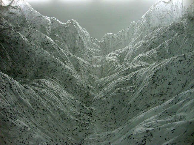
Yasuaki Onishi, Reverse of Volume RG, 2012, plastic sheeting and black hot glue

Whatever is fitted in any sort to excite the ideas of pain and danger, that is to say, whatever is in any sort terrible, or is conversant about terrible objects, or operates in a manner analogous to terror, is a source of the sublime; that is, it is productive of the strongest emotion which the mind is capable of feeling. I say the strongest emotion, because I am satisfied the ideas of pain are much more powerful than those which enter on the part of pleasure. Without all doubt, the torments which we may be made to suffer are much greater in their effect on the body and mind, than any pleasures which the most learned voluptuary could suggest, or than the liveliest imagination, and the most sound and exquisitely sensible body, could enjoy. Nay, I am in great doubt whether any man could be found, who would earn a life of the most perfect satisfaction at the price of ending it in the torments, which justice inflicted in a few hours on the late unfortunate regicide in France. But as pain is stronger in its operation than pleasure, so death is in general a much more affecting idea than pain; because there are very few pains, however exquisite, which are not preferred to death: nay, what generally makes pain itself, if I may say so, more painful, is, that it is considered as an emissary of this king of terrors. When danger or pain press too nearly, they are incapable of giving any delight, and are simply terrible; but at certain distances, and with certain modifications, they may be, and they are, delightful,as we every day experience. [Edmund Burke, A Philosophical Enquiry into the Origin of Our Ideas of the Sublime and Beautiful, 1757]

Thus, too, delight in the sublime in nature is only negative (whereas that in the beautiful is positive): that is to say, it is a feeling of imagination by its own act depriving itself of its freedom by receiving a final determination in accordance with a law other than that of its empirical employment. In this way it gains an extension and a might greater than that which it sacrifices. But the ground of this is concealed from it, and in its place it feels the sacrifice or deprivation, as well as its cause, to which it is subjected. The astonishment amounting almost to terror, the awe and thrill of devout feeling, that takes hold of one when gazing upon the prospect of mountains ascending to heaven, deep ravines and torrents raging there, deep shadowed solitudes that invite to brooding melancholy, and the like-all this, when we are assured of our own safety, is not actual fear.

This makes it evident that true sublimity must be sought only in the mind of the judging subject, and not in the object of nature that occasions this attitude by the estimate formed of it. Who would apply the term “sublime” even to shapeless mountain masses towering one above the other in wild disorder, with their pyramids of ice, or to the dark tempestuous ocean, or such like things? But in the contemplation of them, without any regard to their form, the mind abandons itself to the imagination and to a reason placed, though quite apart from any definite end, in conjunction therewith, and merely broadening its view, and it feels itself elevated in its own estimate of itself on finding all the might of imagination still unequal to its ideas. [Immanuel Kant, The Critique of Judgment, 1790]

When we think of the sublime, we think of the landscapes of Caspar David Friedrich--solitary figures dwarfed by immense mountains, oceans, icebergs, etc. Current artists who tread this ground are James Turrell (who is constantly installing sublime-appreciation devices called Skyspaces wherever someone will pay him to do so) and Olafur Eliasson.

Should I add Yasuaki Onishi to that list? I mean, look at that snowy valley between those mountains! The awe-inspiring immensity! The soul-crushing depth! The craggy terror! It sure looks pretty sublime to me.

Oh, wait.

That's upside down. Sorry. This is what it really looks like.
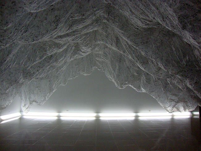
Reverse of Volume RG
Yasuaki Onishi, Reverse of Volume RG, 2012, plastic sheeting and black hot glue

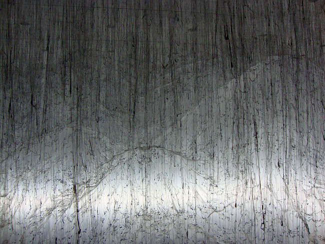
This is the view from the inside. From what I understand, Onishi stacked up a bunch of boxes in the Rice Gallery. Then he draped those boxes with wrinkled plastic sheeting. Then he attached the sheeting to the ceiling with strings (I can't tell if the strings are made of dripped hot glue or if he just used strings to guide the hot glue drips--or something else altogether). Then he removed the boxes--leaving this negative space that looks strikingly like rugged, snowy mountains. The plastic looks like snow and the black hot glue looks like exposed rock.
Reverse of Volume RG
 Yasuaki Onishi, Reverse of Volume RG, 2012, plastic sheeting and black hot glue

This is a view of Reverse of Volume RG from the outside, where you can see the strings. This is what you see before you walk into the Rice Gallery. So in a sense, before you experience the landscape, you see the method by which it was made. And for some, that might break the magic spell.

But once you are under the sheet, with the omnipresent glow of the floor-hugging lights, it's a pretty impressive sight. It surrounds you with this strange upside-down mountain-scape. On one hand, Onishi is undermining the sense of the sublime--by showing the backdrop, the view behind the facade, the trickery. He undermines the idea of the sublime by using cheap, disposable materials like plastic sheeting and hot glue.

But then he creates this all-surrounding environment that is quite powerful. I hardly think that for most people it will inspire "terror," but I bet there are quite a few exclamations of "Oh, wow!" Onishi, in the end, flips back and forth between an attempt at creating a sublime experience and an undermining of that experience. In this way, his art seems a bit more humane and grounded than Turrell's.


Share

Saturday, April 28, 2012

Richard Stout's History of Art in Houston

by Robert Boyd

For the past few weeks, I've had the privilege of working on a video featuring artist Richard Stout talking about the history of Houston's art scene in the 1950s and '60s. The YouTube videos below are the fruit of that work. This talk by Stout is an expansion of a short lecture he gave at the CASETA convention a few years ago. CASETA is the Center for the Advancement of Early Texas Art, which they define as "art produced by artists who were born in and/or lived and worked in Texas through 40 years prior to the present date." Stout had 30 minutes to talk about 60 artists and decided later to expand the talk.

In addition to discussing specific artists, Stout talks about the founding, growth and evolution of key Houston institutions like the Contemporary Art Association/Contemporary Art Museum, the Museum of Fine Arts, and the art departments at Rice, the University of Houston, St. Thomas, and TSU as well as the gradual proliferation of galleries during those two decades. Underlying all of this is the growth of Houston itself. In 1950, Houston had a population of 596 thousand. By 1960, that was 938 thousand, and by 1970 it was 1.2 million. Given this, it is hardly surprising that the number of artists increased and that the institutions grew and expanded their scope.

But enough of that. Watch the videos. Stout was a witness to much of this and is an erudite, scholarly man. I found this history--almost all of which was unknown to me--utterly fascinating, and I hope you will as well.

Part 1


Part 2


Part 3


Part 4


Part 5


Part 6


Part 7


Share

Tchotchkes, Knickknacks and Scale Models at Devin Borden

by Robert Boyd

You don't see a lot of sculpture in galleries. Work tend to be "wall art"--paintings, photos, drawings, collages, reliefs, etc. The reason is obvious--sculpture is hard to own and display. For a collector, sculpture displaces furniture. It renders some amount of floor space unusable. It's just not as convenient to collect as wall art. So that means sculpture is not something you see very often in art galleries. And that's too bad.

But Devin Borden got around the inconvenience factor with his show Table Top by showing mostly very small sculptures--the kind that can fit on a bookshelf or in a china cabinet. The funny thing is that when I think of pieces like that, I think of ceramic tchotchkes. Things your grandmother might have cluttering up her parlor. Or to be more modern about it, the toys and action figures that hipsters and comics nerds collect--you can buy stuff like that at Domy or Bedrock City.

And in a way, the work in this group show is a variation of that. Matt Messinger's pieces seem to be a direct riff on that theme of grandmother-friendly ceramic tchotchke.


Matt Messinger small sculpture installation


Matt Messinger, Untitled (Cat), 2011, found ceramic, buttons, resin

When I see stacks of buttons like that, I think of Tara Donovan, but her use of them is clearly different. She uses identical buttons to create a texture. Her buttons tend to have neutral, unassuming colors. Messinger is going for color with his stacks.


Matt Messinger, Untitled (Owl and Teacup), 2012, found ceramic, buttons, resin

So unlike Donovan, I think Messinger is all about these little ceramic things and the buttons for what they signify--I kind of domesticity that reminds one of  of a particular place and time. You are a child and you visit your aunt or grandmother and you see these things, and you nose around, looking in drawers (because you're bored) and you find old buttons. The three twisting stacks of buttons in untitled (Owl and Teacup) reminded me of DNA. And this kind of stuff is in our DNA. It's a part of our collective culture.


more Matt Messinger in the back room

Awww, cute!


Sharon Engelstein, Cat Mount, 2008, plaster and cyanoacrylate adhesive 3-D print

Also verging on cute is Cat Mount by Sharon Engelstein. But it's also kind of mysterious. Because the image is small, when I saw it I saw it as a scale model for something bigger. With the jagged rock-like form and the steps on the right, you could see it as the top of a rock outcropping, or the very summit of a mountain. And on top of this mountain is a strange piece of cartoon-cat-shaped equipment. It has two pipes, implying liquid or gas moving through it. It could almost be a piece of gas pipeline equipment. Except that it's cat-shaped. I imagine that someone has taken a long stairway up the side of a mountain--not a high mountain (no snow), but still it took some effort to get to the top. And then you behold this mysterious piece of equipment. To me, that would be like discovering that magic is real. It's a hike up a mountain worth taking. Needless to say, I love this little sculpture.


Sharon Engelstein, Bumbry, 2002, plaster and cyanoacrylate adhesive 3-D print

This earlier piece, Bumbry, feels like a model for one of her large forced-air pieces, but I have never seen this particular arrangement of bulbous partial spheres in any of those larger pieces. But like the inflatable pieces, it is playful and biomorphic.


Nicholas Kersulis, Objects for a Table (Rocks: Taos: Rumsfeld), 2010, black gesso on found rocks/studio table with Cornforth White paint

These rocks by Nicholas Kersulis are not cute at all. Kersulis was a Core fellow a few years ago. I've seen similar pieces to this where he used white gesso. I don't know how he makes the gesso so thick, except that maybe he paints on layer after layer. Gesso is naturally white because it's made out of gypsum and chalk, but it can have pigment mixed in, which is presumably the case here.


Nicholas Kersulis, Objects for a Table (Rocks: Taos: Rumsfeld) detail, 2010, black gesso on found rocks/studio table with Cornforth White paint

The way the gesso part of each rock is kind of swirly makes it look a bit like obsidian (although less glassy than obsidian). Its utter blackness reminds one of coal or asphalt. The fact that the rocks are bisected in a way--the bottom half natural rock, the top half black thick gesso, make me think of rock strata. And the display on the table looks like a collection. With a glass top to turn it into a vitrine, it could be a display in a natural history museum. But one can't get around the fact that the gesso portion of each "rock" looks weird and unnatural. And ironically, that's what is so appealing about them.


Kaneem Smith, Untitled (White), 2010, cloth, cotton balls, wax; and Wring Out, 2012, burlap, cotton, wax

Kaneem Smith's work goes a bit off message--Untitled (White) is a wall hanging instead of a table-top sculpture. But the scale is the thing, really. Even though Smith is working on table-top scale, she has produced work that is the opposite of cute (like Kersulis). These pieces are not going into auntie's china cabinet. The work is grungy. The use of burlap and cotton perhaps are meant to recall the importance of cotton in Houston (and the South generally), and the grungy quality of the work, as well as the "wrung out" aspect of Wring Out may be a reference to the back-breaking labor, performed first by black slaves and later by black sharecroppers in appalling conditions.

 
Darryl Lauster, Diarama, 2011, found toys, electric motor, wooden table

Darryl Lauster takes U.S. history and the American scene as the subject of his often quite amusing artwork. Diarama [sic] takes on the revolutionary war. The motor keeps the seesaw element rocking back and forth--sometimes the British are up, sometimes the revolutionary soldier is up.


Darryl Lauster, The New World, 2012, acrylic, electric aquarium pump, steel, brass, water, cement and silicone

The New World seems especially appropriate for Houston. In fact, I'm always puzzled by the relative lack of art that relates to oil and gas production. It was in 1863 that Charles Baudelaire in "The Painter of Modern Life" instructed artists to look around and depict the modern world in which they lived in their art. And yet, oil production remains under-explored as an artistic subject. This witty piece, like The New World, has a kinetic element--bubbles pumped from the bottom that make the octopus clinging to the side of the platform move. Folks in the oil industry will recognize that this is a fairly archaic form of drilling platform.

Thematically, there is little to link these artists. Lauster and Smith both touch on industries that are associated with Houston historically. (Kersulis rocks, if you see the black gesso as symbolic of oil-bearing rock, could also be read as relating to oil production.) Messinger explores cuteness and nostalgia, and cuteness is touched on by both Engelstein and Lauster. But mainly what we have here is a heterogeneous collection of small sculptures, each with its own virtues.


Share


Friday, April 27, 2012

Criticism or Diagnosis--The Dilemma of John Adelman's Art

Robert Boyd

I recent read Perfect Rigor: A Genius and the Mathematical Breakthrough of the Century, a biography of Grigori Perelman by Masha Gessen. Perelman is a great mathematician who solved the Poincaré conjecture, which was one of the great unproved math problems. But Perelman is also extremely eccentric, to say the least--an extreme misanthrope who has now cut himself off completely from all human contact except, apparently, for his mother. He even turned down a $1 million prize for solving the Poincaré conjecture for reasons that from the outside seem utterly inexplicable. In the book, Gessen discusses the details of Perelman's behavior with a variety of psychologists and neurologists who conclude that he may have Asberger's syndrome, a type of autism that allows one to function in human society but that makes it hard for one to understand other people.

I thought of Perelman as I looked at the work of John Adelman at Darke Gallery. Adelman's art consists of paintings/drawings created by methodical, repetitious, and indeed tedious actions. For example, with 3212 (nails), Adelman dumped 3212 nails onto a black wood panel then carefully drew an outline of each nail where it dropped with a white gel pen.


John Adelman, 3212 (nails), mixed media on wood panel, 24" x 24"

What can you say about this? First, you might recall that Jean Arp did something similar--he would tear colored paper into squares and drop them onto a larger piece of colored paper. He would glue the pieces he dropped where they landed. In short, chance, rather than human agency, determined the final composition of the work.

Second, one might think of the wall drawings of Sol Lewitt, where the work was really the set of instructions or rules that Lewitt created rather than the final result. For each drawing, Adelman creates a set of rules for himself and then more-or-less mechanically executes the rules.


John Adelman, 73160 (straw bale), gel ink on paper, 29" x 48"

You could make 73160 (straw bale) yourself, if you had plenty of time and patience. It would be different from Adelman's--the number of pieces of straw in the bale would certainly vary, and the random location of each piece of straw would be different as well. But the idea would be the same.

I asked Adelman why, then, did he just not hire someone to execute the pieces? He said something about the process of doing it being important to him. He likes counting the nails and pieces of straw. He likes numbers in general--he can tell you how many hours he spent on each piece. And as you might expect, these pieces are so laborious that he has little time for anything else. He said making these things leaves him with no spare time to do other things. Which starts to sound a little like Gregori Perelman, although unlike Perelman, Adelman seemed quite capable of and willing to carry on a conversation with another person--at least about his art.

So when you look at the pieces and ponder their making, things like Asberger's syndrome or obsessive-compulsive disorder come to mind. That's what I meant by the phrase "criticism or diagnosis." Do we approach this work (and the process of making it, which is clearly an important aspect of it) through criticism? Or do we do we attempt to make an amateur diagnosis of the artist? The latter option strikes me as inherently unethical. And yet, we do this unethical thing all the time when discussing certain artists and writers. It's hard not to think of people like Antonin Artaud, Malcolm Lowry, or Forrest Bess without thinking about their psychological problems. Their work seems so intertwined with their mental health. And those were three that popped into my head--I think without much effort, I could come up with a list of dozens. And no matter what one thinks of Adelman's pieces as works of art, the more one knows about the process of making them, the more curious one becomes about his state of mind. Or, at least I'm curious about it.


John Adelman, Empty, 48" x 48", gel ink on paper

Adelman describes Empty as "a stable structured design of handwritten dictionary definitions." He uses the dictionary because he sees it as neutral (having no political, religious or personal meaning). Presumably he also uses it because you can go through it methodically. (Of course, there is ideology in dictionaries. At the very least, we have to say that dictionaries, like encyclopedias, are products of the the Enlightenment.)


John Adelman, Empty detail, 48" x 48", gel ink on paper

But in the end, we are left with a piece that looks like something. The process is never not going to be important, nor the mind of the person who created it. We can't pretend those things are irrelevant. But I look at Empty and see this fuzzy but highly regular patter. And I look at 142136 (nails) and see these falling curtains of light that strike me as beautiful.


John Adelman, 142136 (nails), mixed media on paper, 48" x 96"

That John Adelman dropped 142,136 nails onto this piece of paper and drew an outline of each one is perversely fascinating, but if the result wasn't interesting to look at, would we care? Instead, what remains is a work of art that is, for me at least, delightful to see.


Share


Tuesday, April 24, 2012

Read My Review of John Waters' Art

by Robert Boyd

Headline #1
John Waters, Headline #1, 2006. C-print, 22.5 x 98 inches, edition of 5

This show is of filmmaker John Waters' artwork is on view at McClain Gallery for just a few more days. And I have a review of it at Temporary Art Review. CHEGGITOUT!


Share


Artists Getting Paid

by Robert Boyd

Hyperallergic has a couple of really great posts about artists not getting paid. The main article is by art provocateur William Powhida. The title is suggestive: Why Are (Most) Artists (So Fucking) Poor? But the post doesn't address this question in a general sense, but rather discusses a small but obvious part of it. In this article, he talks about a survey of artists who displayed work in New York non-profit spaces between 2005 and 2010 by W.A.G.E. (Working Artists and the General Economy).
On Friday evening W.A.G.E. presented the results of its 2010 survey of payments received by artists who exhibited with nonprofit art institutions in New York City between 2005 and 2010. The survey found that 58% of artists who responded received “no form of payment.”  The audience, including Artists Space director Stefan Kalmár, asked questions critical of the survey methodology, but did not refute the group’s findings. W.A.G.E. has partnered with Artists Space to explore the development of a self-regulatory model, mandating the implementation of a fee schedule within the institution. Presenter A.K. Burns explained one of the rationales for artists fees, “nonprofits get money from different sources for public education, and the artist is the educator. We are wondering why the artist isn’t being paid?”  That artists should be remunerated for their cultural value in capital value is one of W.A.G.E.’s positions from its statement and one that remains controversial. [William Powhida, "Why Are (Most) Artists (So Fucking) Poor?", Hyperallergic, April 23, 2012]
When you think about this, it's kind of weird. I am on the board of Frenticore/Frenetic Theater. I've looked at our books in great detail. When we put on a show (for example, the Houston Fringe Festival), we pay the performers. We are a non-profit, so we get our money from donations, grants, and charging folks to see the shows we produce or charging folks to use our theater space for their own shows. Why would an art exhibit at a non-profit space be different? (By the way, if you have an act and want to be in the Houston Fringe Festival, the deadline for submission is May 1, so get to it!)

But a theatrical or dance performance is different. First, it's expected that the theater will charge people to see it. And more important, with a performance, the performance itself is the work. And so we pay for the work. A visual artist, by contrast, has something physical to sell (I'm not going to get into the issues around installations or other temporary/immaterial artwork). So the theory is that for an artist, being in a show at a non-profit space gives you exposure with which you can then leverage to sell physical artworks. An exhibit at such a space is like a really long television commercial for your work. And there is some truth to this. Greater exposure in high-profile venues makes selling work easier, on average.

The question is whether this justifies no payment at all from the non-profit venue. I don't think so. Sure the artist gets a small, indefinable benefit, but so does the institution. They aren't showing this work as a favor to the artist. So in a way, they are like any other venue for creative work. If a magazine or newspaper publishes your work, they pay for one-time rights. A non-profit venue should do the same.

Why Are Artists Poor
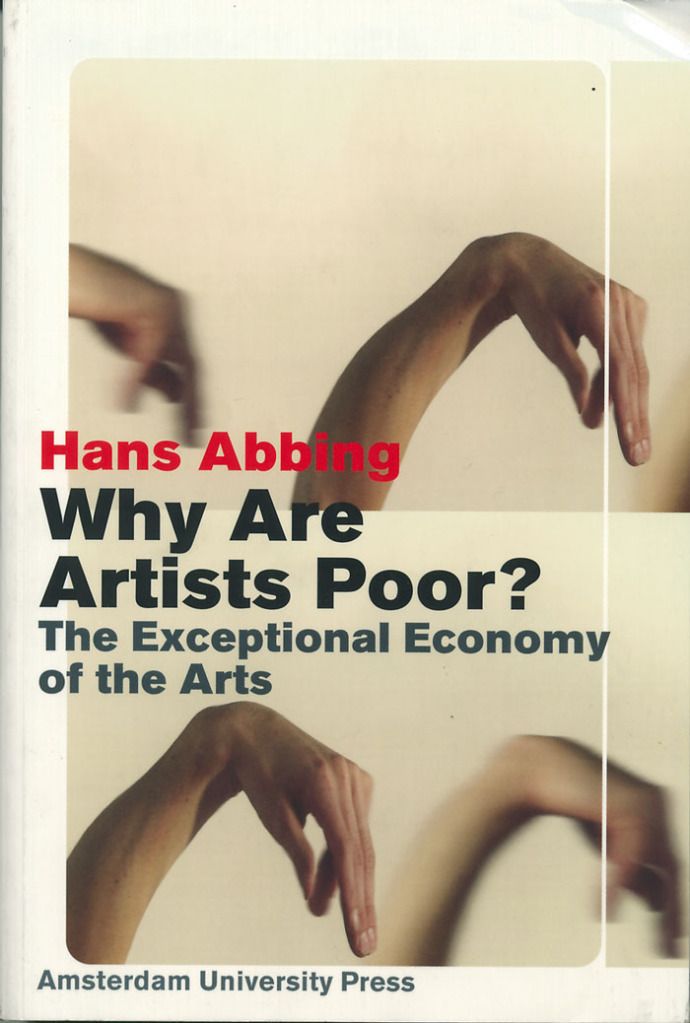
Hans Abbing, Why Are Artists Poor?: the Exceptional Economy of the Arts. I have no idea if the contents of this book, which I have not read, are relevant here, but it seems apropos.

One argument that a non-profit might make is that they don't have a lot of money. And with certain exceptions, this is true. I don't expect non-profit art spaces, as a class, to suddenly conjure thousands of dollars out of thin air to pay artists. But they should pay artists, and the money needs to be taken from within the institution. Maybe this means fewer shows per year, or a smaller staff or less marketing. It would be a real sacrifice. I'm not denying it. But as someone who sits on the board of a non-profit that pays its artists, I know it can be done.

One wonders how it got to this state. But the answer is economically obvious. More people want to be artists than there is demand for art. In fact, people are willing to be poor if that's what it takes to be artists. It's one of those professions that attracts way more people than can be reasonably paid. So this makes it a buyers market--and non-profit art spaces are, essentially, buyers of art. I don't mean that that they have collections, but they do essentially rent art for six weeks or so at a a time. And right now, the rent they pay is close to zero. That should change.

To see a bunch of infographics put together by W.A.G.E. on this topic, see this post.

(Fair disclosure. The Great God Pan Is Dead doesn't pay a piaster. Dean Liscum is being totally exploited by me. I am an utter hypocrite. Just thought I should point that out.)


Share


Monday, April 23, 2012

Evolving the Role of Art Dealer: UNIT

by Robert Boyd

A few weeks ago, I saw Ariane Roesch's pop-up gallery, UNIT, at Kinzelman Art Consulting. I was curious about UNIT, which is basically an online store for limited edition prints in various media. So I asked Roesch if I could ask a bunch of nosy questions about her online enterprise, and she graciously consented.

I'm particularly interested in art sellers like UNIT because they offer an alternative to galleries. Not that there is anything inherently wrong with galleries (galleries of the world--you know I love ya!), but for many would-be art buyers, galleries have a series of problematic features. They tend to be pretty pricey--which leaves less wealthy art lovers out. They tend to be somewhat confusing, opaque sales environments for newbies. What a site like UNIT does is offer--for some buyers--a more comfortable buying experience.

I sent Roesch a series of questions about UNIT, which she has answered below.  The artwork used to  illustrate this post is all available from UNIT.

Orange Colgate
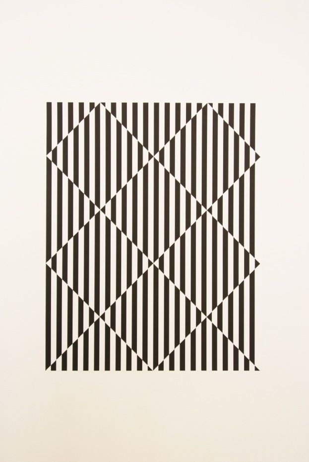
Lewis Mauk, Orange Colgate, Serigraph (silkscreen), edition of 10, size 11”x40” inches

What is UNIT? When did it begin?
UNIT is an online resource and store for limited edition prints, products, and prints by emerging and established artists. Each item is unit of a whole, at least an edition of 10 but no more than 100, available as a whole UNIT. This means that one can either purchase a print as is or already matted, framed and ready to hang on your wall – UNIT even provides the hanging hardware complimentary. UNIT represents and only frames with HALBE. They are easy to use, front-loading magnetic picture frames that are manufactured in Germany. Each HALBE Frame comes already pre-assembled - as a UNIT - with glass, backing, and a storage box and does not require any additional tools to frame. It’s a simple, clean, and fully archival design that makes it easy to reuse or install at a permanent location. UNIT was created the 1st day of Christmas 2011, 12/1/2011, and officially was launched Valentine’s Day 2012 featuring a special edition – ‘Love Your UNIT’ – a framed linocut print available for $50.

Did you found UNIT? If so, why?
I have a personal weakness for printed material and limited edition pieces. As an artist, I like to construct hand-made pieces – objects, books, cds – as a small edition. I love prints, flyers, street art, quirky artist books, multiples, etc… the whole printmaking ritual is really fascinating to me as well as the idea of making multiples – it’s a very interesting and affordable way to promote and self-publish. Although we have a large print community in Houston - Burning Bones Press and the PrintMatters Group to name a few – there isn’t a commercial art space in Houston specifically dedicated to limited editions. UNIT is a way to showcase work from local, national, and international artists. Is UNIT meant to be strictly an online art dealer? Although mainly based online, works available on the UNIT website can be viewed at its physical flat file location or during a pop-up exhibition. So far, UNIT has organized two small shows, ‘Picture Your UNIT’ at the Gallery Sonja Roesch for FotoFest and ‘Prop Up Your UNIT’ at Kinzelman Art Consulting. I am currently organizing a large Exhibition, titled ‘Horror Vacui’, to be shown during the summer for PrintHouston in the Gallery Sonja Roesch space. The opening is scheduled for July 14.

Big Calm
Jan van der Ploeg, Big Calm, 2010, screenprint, edition of 25, 50 x 40 cm (19.7" x 15.7" inches)

How frequently does UNIT release new editions/artworks/publications?
Since it is a rolling submission process, new editions can be added as they are accepted. Though the real push for getting new work will be a coming up exhibition, such as the one this summer. Our monthly newsletter will always feature an edition as well as mention any new additions.

How would you compare UNIT to other online art dealer/publishers (for example 20x200)?
There are tons of websites that sell affordable artwork or limited editions from established artists, but UNIT, as the name suggests is really about providing a full package so to say… not just selling affordable art but also providing the framing, hanging hardware, tools and advice on how to install work, take care of it, keep track of it and essentially starting an art collection. Its kind of a fusion between ventures like 20x200 and sites like Fuse-Works or Grey Area with an IKEA sensibility: real art by real artists made easy to acquire, install, and take care of. Even though it is not an “original”, it is still a unique piece since each piece is hand-made/hand-assembled by the artist – this is why UNIT does not feature anything completely digital.

Does UNIT specialize in local/regional art? Or is it art from all over?
The work is from all over. Currently UNIT features artists based in Houston, Los Angeles, Boulder, and France. How do you choose the artists UNIT is selling work by? The work has to fit the basic criteria: An edition of at least 10 but no more than 100, hand-made or hand-constructed by the artist or a press, nothing digital and if digital, there should be a non-digital component to it. Although I don’t want to assume an absolute curatorial role, I essentially make the decision. I’m striving to keep an open policy through a process or referrals, suggestions, and an always open and rolling submission process. What I do look for are Artists that work in a variety of media, and see the idea of a multiple as a field of artistic discourse and inquiry itself, rather than a way to mass-produce their work.

"Malicious Compliance" (part I of III)
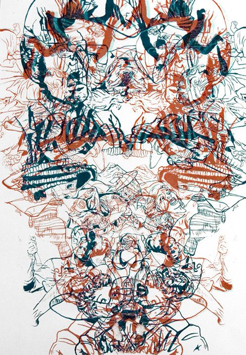
Gissette Padilla, Malicious Compliance (part I of III), edition of 5, Positive Lithography, 22" x 30" inches

How does UNIT promote/advertise itself?
That’s going to be an ongoing and evolving process as UNIT grows. Currently we have a monthly newsletter, Facebook, Google, a listed shopping cart, press, and events through pop-up exhibitions. We are in the process of being listed on printed-editions.com a website that lists galleries dealing with limited editions, mainly prints by established artists, and we will be looking into more web based advertising as the year progresses.

Does UNIT print the works? If not, who does? (I know the work is in various media, so I assume there are multiple printers.)
UNIT doesn’t print any of the work - all items are made by the artist or a printing press. UNIT can produce in terms of connecting people. I work closely with the artist or organization to develop an idea for an edition based on their work and then find the best and most efficient and economical way to produce it. For example, I’m currently working with Glasstire to develop a set of editions that will be launched and for sale through UNIT starting this summer. The proceeds from these editions will benefit Glasstire.

Alarmist Gets Her Curl
Harry Gamboa Jr., Alarmist Gets Her Curl, 2005, from the series Siren's Post-Acid Complex, Edition of 40, 16" x 24" inches

You are an artist and some of your own art is available through UNIT. Do you foresee difficulty being both an artist and an entrepreneur? Both in terms of time commitment and in terms of the basic difference between the two roles--or have these roles converged (i.e., Murakami or Jeff Koons)?
I define an entrepreneur as someone who is self-employed and with that definition I think all artists essentially are entrepreneurs. Even if you are not pursuing the commercial gallery aspect, you are still self-promoting and pursuing either artist residencies, grants, etc. I consider UNIT a part of my practice. Beyond simply running a space it is the monthly newsletter, the text, the special editions, the tag lines, the ads, etc that I enjoy conceptually playing with and seeing the response. UNIT sells artwork, but the whole project is an artwork as a commercial endeavor. Having an artist space, though it is time consuming, is a wonderful way to connect with and promote other artists that are interested in a similar dialog. It’s more like creating a community. My own work is listed but it’s complemented and enriched by a wide range of other works by other artists. Time becomes the true test. Can you sustain making art and running a space and also continue doing all the “fun” stuff that goes along for both? With UNIT being based online, and occasional pop-up exhibitions as the opportunity presents itself, I’m limiting some of the common stresses of running a space. The goal is to have one large exhibition once a year in the summer to present the current listed work. The rest of the year the newsletter will be the monthly “exhibition” with featured items, special interviews, and other UNIT information.


Share