Two years ago, MANUAL (the team of Ed Hill and Suzanne Bloom), had an exhibit at Moody Gallery on theme of books called The Book Project. It was a fantastic show, I thought, full of clever photos of, well, books. They were beautiful images, and for a book-lover like me, they had special resonance. But when I heard that their new show also consisted of book photos, I thought they were taking a risk of repeating themselves. Would this show would lack the freshness of the previous exhibit?
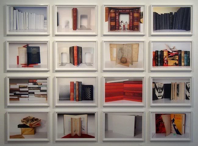
MANUAL, White Shelf Series, archival pigment prints, ed. 5, 16 pieces at 17" x 24.5" each; 81.5" x 100.75" installed
My worries were unnecessary. I actually like Picture Books, the new exhibit, better that The Book Project. What MANUAL does with their photos of books is to create formally interesting images that are also quite beautiful. But because of the subject matter of each image, there is an additional level of meaning beyond the purely visual. (This effect depends to a certain extent on being seen by a literate viewer.) It's bookish art for bookish people--the well-read, the highly educated. I used to assume that everyone who is an art-lover is like this, but experience has instructed me otherwise. I was projecting my own bookishness onto the entire art world. This is work that will have special appeal to glasses-wearing, owl-eyed bibliophiles, who are admittedly a minority.
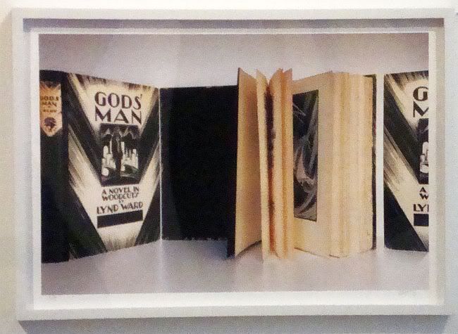
MANUAL, Lynd Ward's Man, archival pigment print, ed. 5, 17" x 24.5", 2012
Some of the photos, like Lynd Ward's Man, appear to be homages to a writer (or, in Lynd Ward's case, a visual artist) that MANUAL likes. The photo shows three copies of Ward's most famous woodcut novel, God's Man. (Actually, it may be that there is only one copy and the three images are separate photos that have been joined in Photoshop--it's hard to tell.) Beyond the images of this art deco classic, there isn't an overt attempt to link the content of Ward's book to the content of the photo. In a way, this photo is one of pure book-lust.
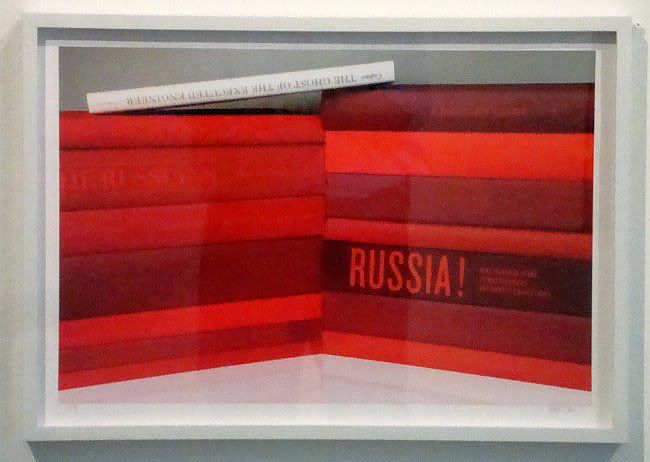
MANUAL, Red Russia, archival pigment print, ed. 5, 17" x 24.5", 2012
In Red Russia, MANUAL links the composition of the photo to the content of the books. It is kind of obvious (though visually striking) to show a bunch of books about Russia with red covers. But notice that the top book, The Ghost of the Executed Engineer: Technology and the Fall of the Soviet Union, is white. This book is about Soviet technology and engineering, springing from the story of Peter Palchinsky, a mining engineer who fought during the late Czarist period for improved mine safety (and whose struggle resulted in 8 years in Siberia by the Czarist government). When the Bolsheviks came to power, he supported them and continued his work for worker safety. He assumed the Soviet Government would be on his side, being a putative government of the workers. Quite the opposite--worker safety was the least of their concerns. (The White Sea Canal, built in 20 months between 1931 and 1933, had a mortality rate of 8.7%. More that 100,000 slave laborers worked on it.) Palchinsky's constant complaining about worker safety earned him a state execution. The photo shows a wall of red books with the slim white book on top. The wall could be said to represent the mammoth ill-conceived engineering projects of the Soviet Union, with the white representing the human cost of those projects.
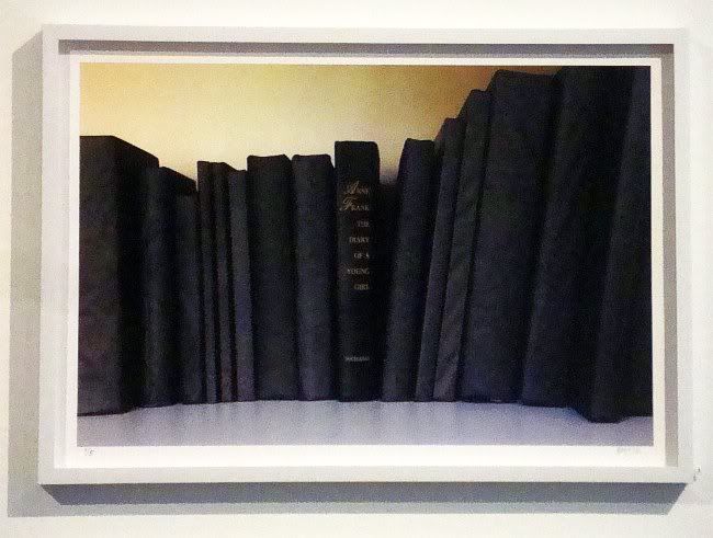
MANUAL, Black Books (Anne Frank's Diary), archival pigment print, ed. 5, 17" x 24.5", 2012
In Black Books (Anne Frank's Diary), the deeper meaning is a bit more obvious, since Anne Frank's Diary is something that most people have read or at least know about. But in case you don't , Anne Frank was teenaged girl whose Jewish family was forced to hide from the Nazis in an attic in Amsterdam for the majority of World War II. In 1944, they were betrayed, captured by the Nazis, and sent to Auschwitz. Of the Frank family, only Otto Frank, Anne's father, survived. He returned to their hiding place, found his daughter's diary, which was published and has since become a classic, a wrenching eye-witness account of the Holocaust. It's not really a "black" book, though. Anne has her ups and downs, but she remains optimistic in the book. Obviously, the was unable to write of her capture and trip to Auschwitz. But because we, the readers, know her fate, the book becomes an account of human evil--that a young intelligent girl like Anne could be mindlessly snuffed out by unthinking evil on an industrial scale. So as with Red Russia, we end up with a striking, minimal composition and a vast historic evil behind it.
Not all the photos are so serious. Some are all about design and composition, turning their books into somewhat constructivist designs.
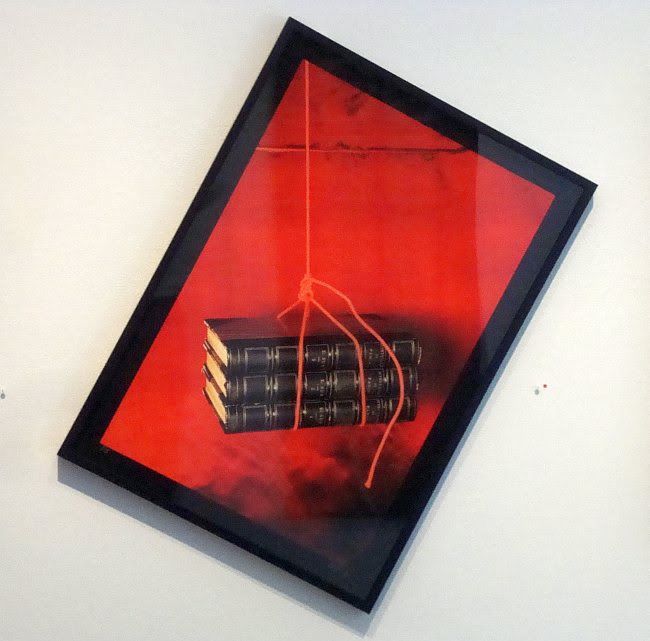
MANUAL, Mysteries of Paris, archival pigment print, ed. 5, 31" x 22", 2012
Mysteries of Paris is one where I think design is the most important aspect of it. That isn't to say that the composition isn't related to the books. Mysteries of Paris was a serialized thriller by Eugene Sue published in France in the 1840s. I haven't read it and never will, but I can easily imagine that its hero, Rodolphe, found himself in dire straits at the end of many of the book's chapters--in other words, like all serial adventure fiction, it relied on cliffhangers.
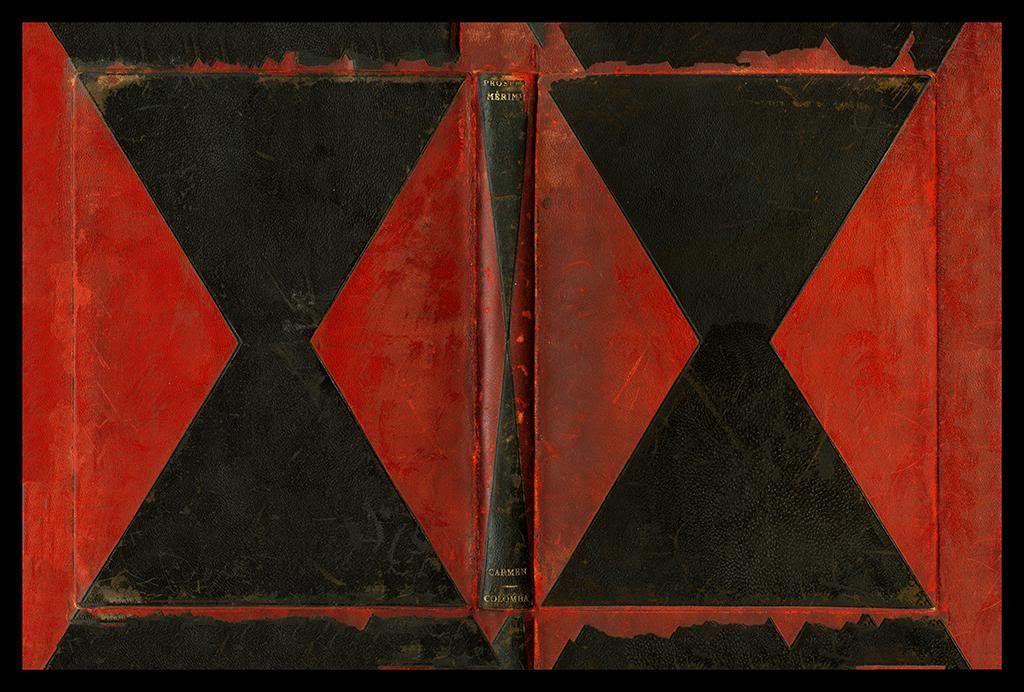
MANUAL, Carmen and Colomba, archival pigment print, ed. 5, 43.5" x 65", 2012
Colomba & Carmen is a book by a French author, Prosper Merimee. That's all I know about it, but I don't think knowledge of the book is particularly important in MANUAL's Carmen and Colomba photo.What is important are the two black figures and the red ground--a simple, direct design. But the design is complicated a bit by what I assume is a bit of Photoshop work. The design on the cover of the book appears to extend beyond the cover, as if the book were face-down on a table with the exact same design, just slightly larger. I believe that MANUAL somehow rubberstamped the cover image to extend beyond the book. The edge of the book is easily discernible, though. One could perhaps make a comment about infinity, particularly if this were a book that toyed with such ideas. And maybe it is.
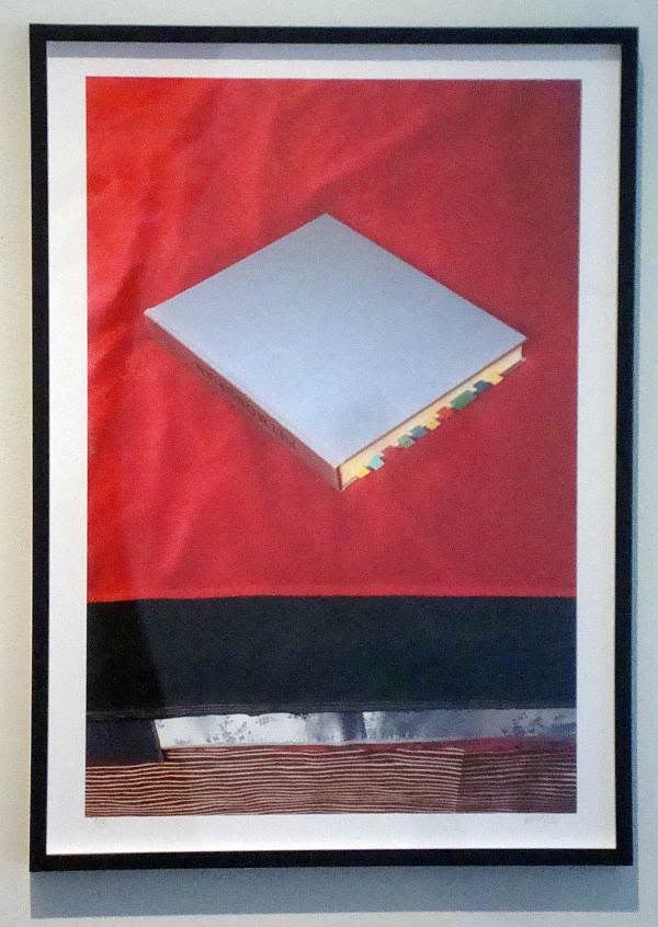
MANUAL, Mondrian on Daybed, archival pigment print, ed. 5, 31" x 21.75", 2012
Mondrian on Daybed is a piece that has a strong, constructivism-influenced design: a Malevich square on a red background, with parallel stripes of color below. That the central element is a book on Mondrian is ironic since it is set on an angle--something Mondrian never used in his iconic geometric abstractions. But at the same time, this is a still-life that is exactly described by its title. It could be a scene from my own house--an art books with little post-it flags tossed casually on the bed as I work elsewhere. It has a kind of intellectual domesticity while simultaneously being able to be read as a flat composition.
Some of the pieces in this show are a bit more complex.
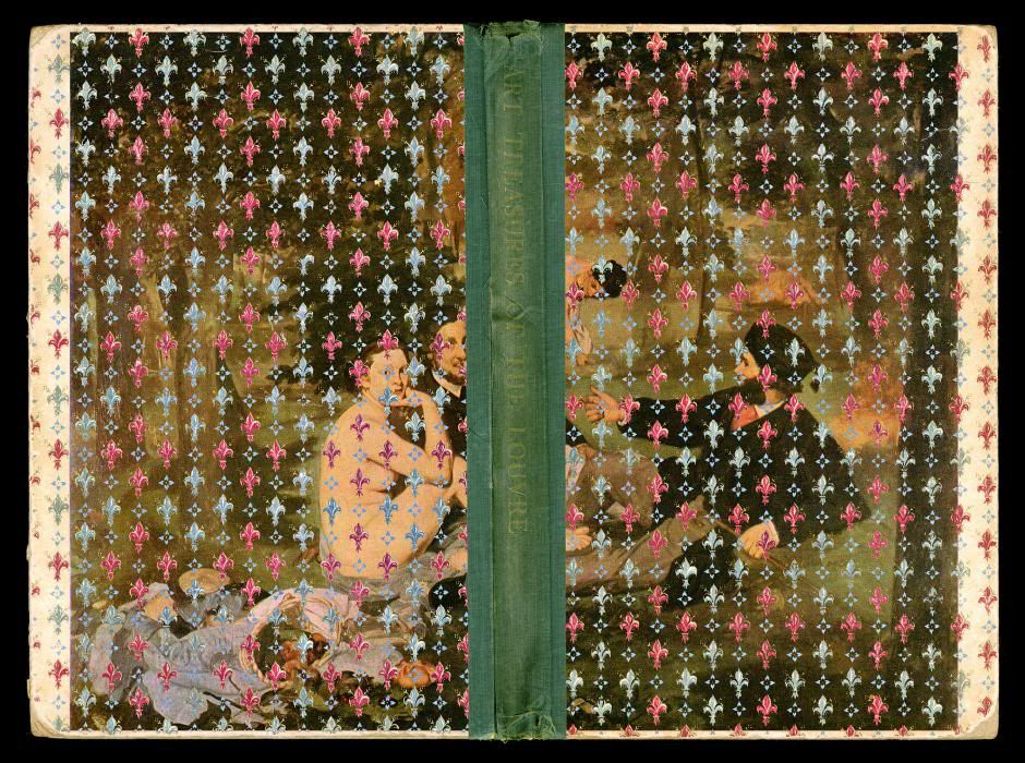
MANUAL, Treasures from the Louvre, archival pigment print, ed. 5, 36.5" x 49", 2012
This is a confusing image. Treasures from the Louvre seems to be a photo the front and back covers and spine of a book. But one can't imagine that this is the actual cover of the book. At least, the fleur de lis pattern must have been added (perhaps in Photoshop?) afterward. Maybe it was the pattern printed on the endpapers. But the result is an image that has an aggressive Frenchness.
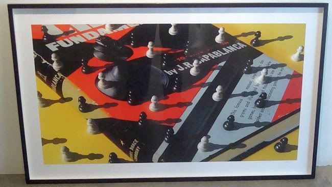
MANUAL,title unknown, date unknown
This chess-oriented print wasn't hung in the show. It was sitting in the back of the gallery on the floor. Here again, it appears that Photoshop may have been used. The black, red and blue-grey chess instruction book looks three-dimensional, but the pawns and their shadows are resting on it as if it were flat. The image of the king on the cover is being overwhelmed by pawns from another dimension. The image is an optical illusion, but it is also a beautiful composition using a limited pallet. (The yellow ground works especially well here.)
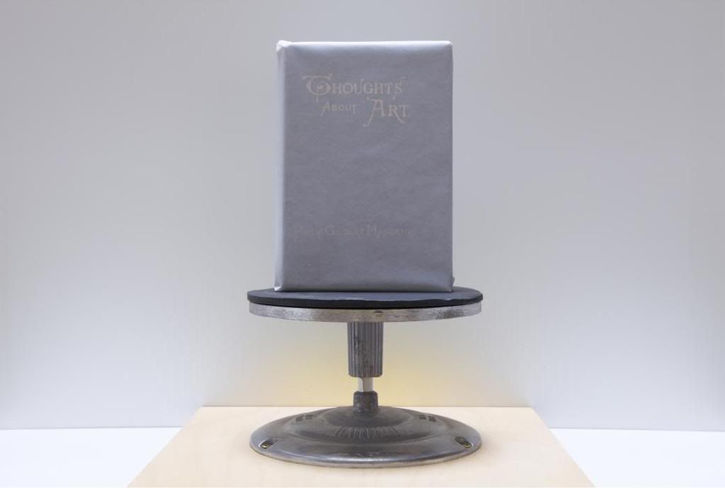
MANUAL, Thoughts About Art, archival pigment print, ed. 5, 28" x 40.5", 2012
In the end, and for personal reasons, Thoughts About Art may be my favorite piece in the show. The book in this piece is Thoughts About Art by 19th century English art critic, Philip Gilbert Hamerton. But every book of art criticism, every monograph, and blogs like the one you're reading now could have that title (not to mention Hennesy Youngman's video series). These thoughts are wrapped in tissue paper and placed on a modest pedestal--about as much glory as an art critic can hope to get, I suppose.
I'm not sure if any bigger "thoughts about art" can be pondered about Picture Books as a project. The sum may not exceed the parts. But perhaps in choosing this subject, MANUAL are acknowledging that the age of books as physical objects has begun to end. A good portion of my reading is done on a electronic devices these days, and I suspect this is generally true among people who love books for what they contain (as opposed to book-collectors, who love them as objects). This exhibit celebrates this glorious piece of not-quite-obsolete technology. It's technology well worth celebrating.


I really need to get on over to Moody to see this show! FYI, Mondrian did sometimes paint on angled canvases, such as http://www.huffingtonpost.com/james-elkins/post_1036_b_756669.html
ReplyDeleteI took the multi-colored little mylar tabs to be the real subject of Mondrian on Daybed....
ReplyDelete